Starting from the bottom : Creating Sensat’s Design System
Assuming responsibility for another significant project, I led the creation of Sensat's inaugural design system, Sensat Jasper. Early in my tenure at Sensat, I identified areas in both the designer's perspective and the handover process from design to engineering that could benefit from substantial improvement.
Streamlining Autonomy for Designers and Developers
Upon joining Sensat, I encountered an existing design system that posed challenges for designers. The component library had its basics, outlining atomic properties, but several issues hindered smooth workflow:
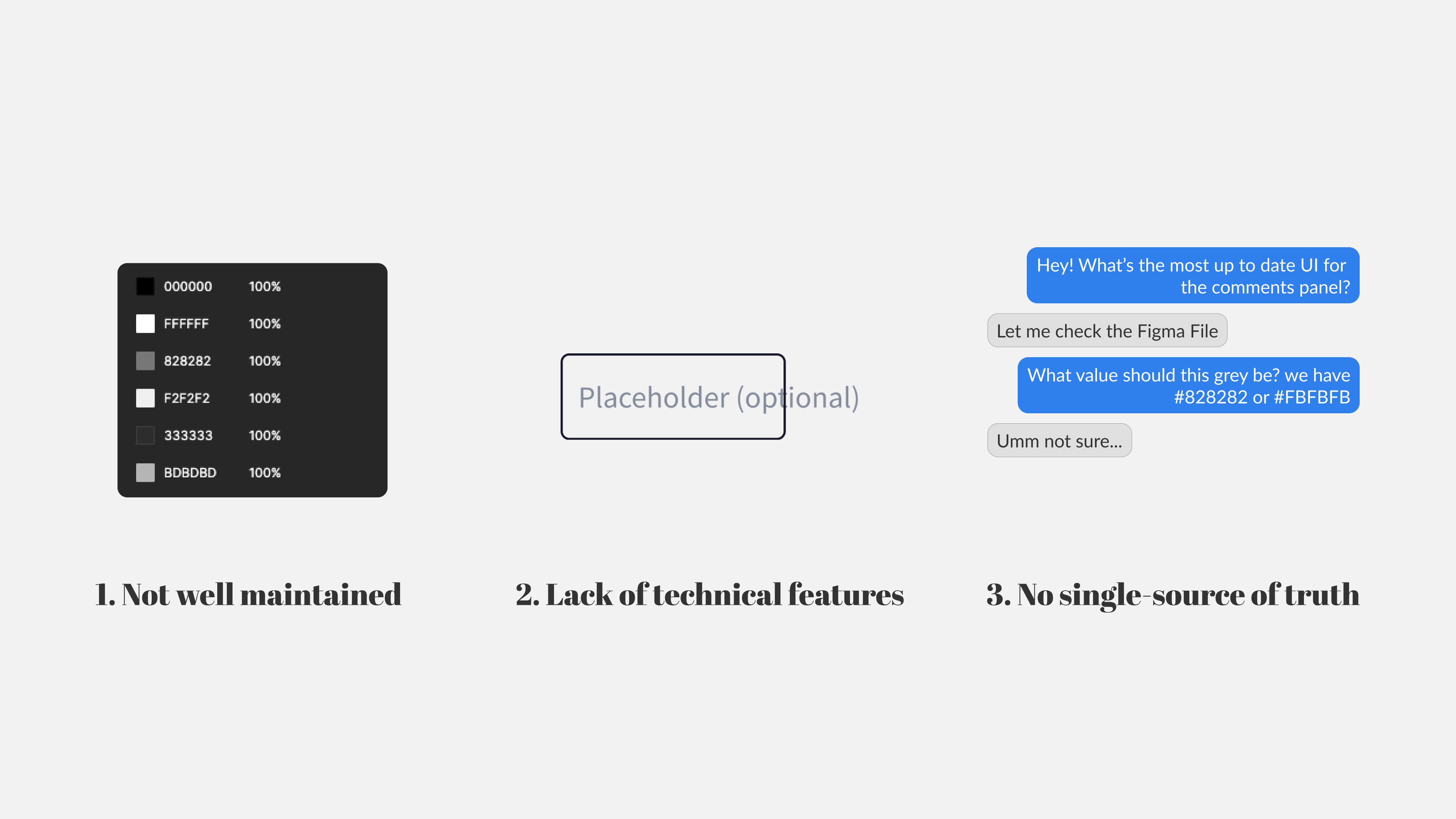
Poor Maintenance: The existing component library lacked proper upkeep. Basic components were present, and atomic properties were noted, but colors were frequently misused. Detached properties and non-compliance with the specified system were common issues.
Absence of Figma Features: Components were created without utilizing Figma features like Auto-Layout. This made it cumbersome to ensure reactivity across different sizes and formats. Mass editing became challenging due to undefined spacing properties. The absence of component variants hindered ease of use, making it difficult for designers to navigate through different states with a single click.
Lack of Single Source of Truth: Due to inadequate maintenance, the library wasn't a reliable 'single source of truth.' Designers often had to extract the most updated UI from various Figma files, complicating the workflow. The collaboration involved checking with other designers to identify the Figma file with the latest UI.
Shallow Component Depth: The component library primarily consisted of 'Molecule' components like buttons and input fields, lacking more complex 'Organism' components for extensive UI. Designers had to start from scratch for intricate UI panels, impeding adoption.
Scalability and Collaboration Challenges: The process of handing over designs between developers and designers faced hurdles. With an unmaintained library, the Build department hesitated to trust components. Developers often bypassed the design system, opting to check Figma files directly, leading to prolonged processes and increased communication with designers.
Audit session with an engineer (Nikita) to go over existing colors in the platform and cut any excess properties
Too many greys
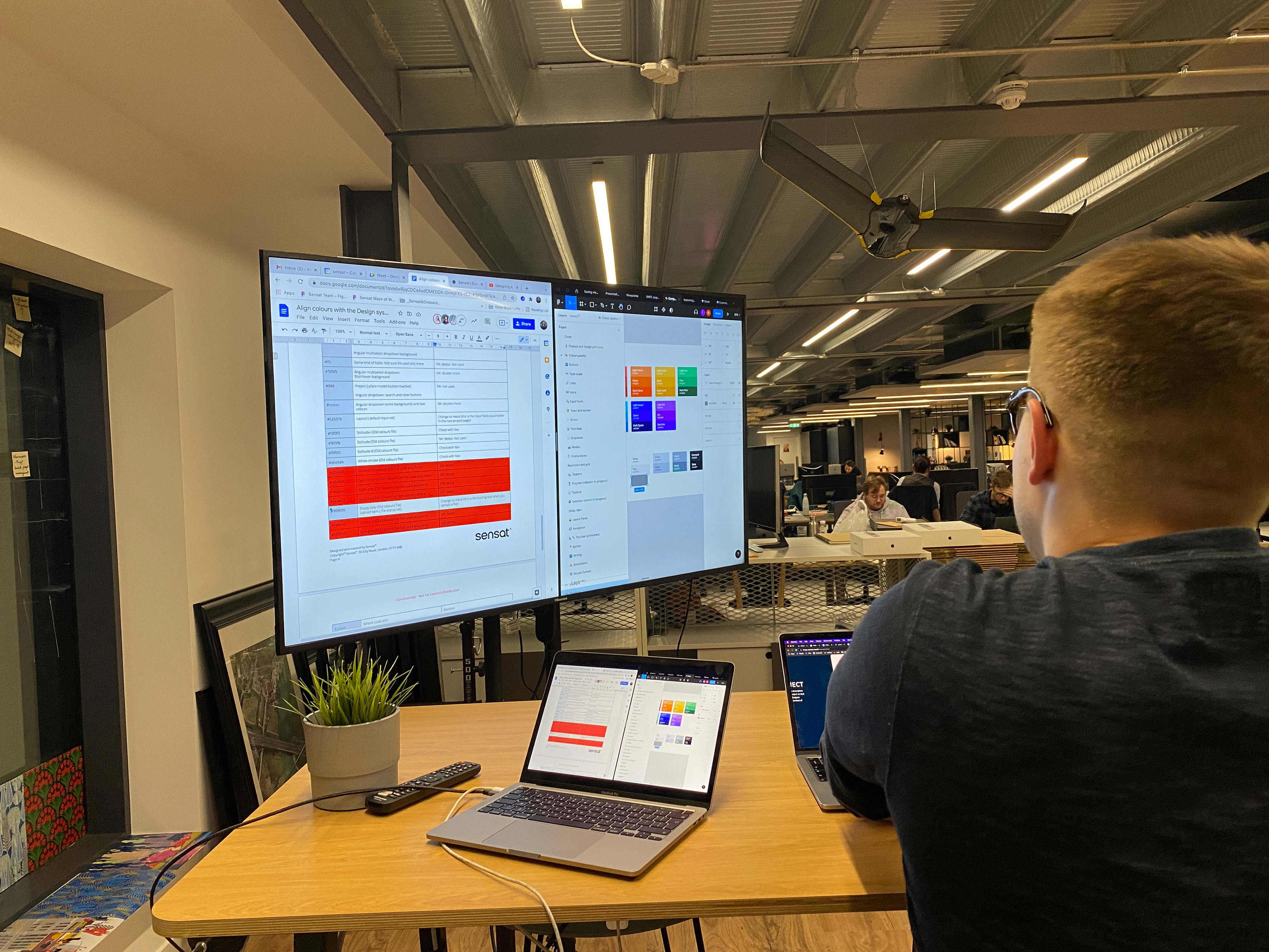
To revamp the design system, our initial step involved conducting a thorough audit of the atoms within the components. This comprehensive process required collaboration with a developer to access the codebase and identify the properties in use. The audit revealed a concerning issue: over 20 different shades of grey were being employed, signalling a misuse of the Design System.
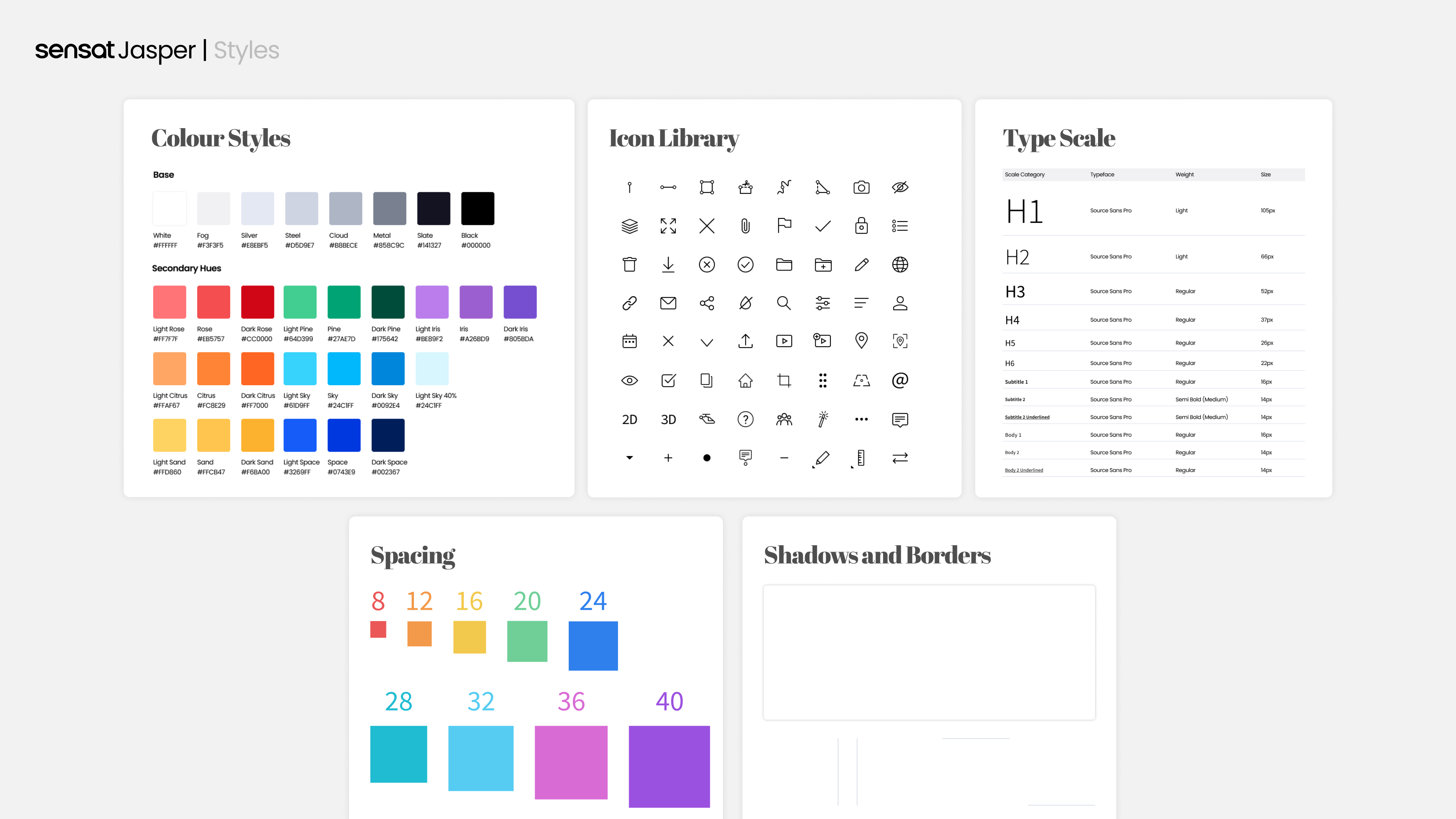
To streamline and bring consistency, we relied on our intuition to match greys to the closest colours in the spectrum. Through this effort, we successfully reduced the variant count of greys from 20+ to a more manageable 10.
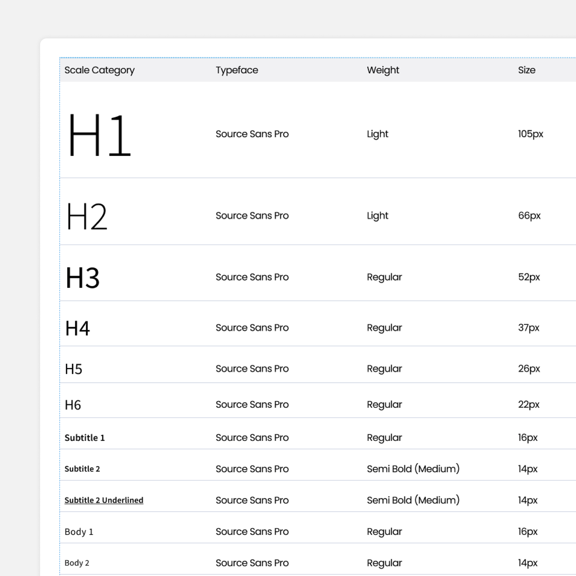
This optimisation process was not limited to colours; we extended it to typography as well. Leveraging Google Material, we defined a standardised type scale, ensuring uniformity and coherence across the design system.
To streamline and bring consistency, we relied on our intuition to match greys to the closest colours in the spectrum. Through this effort, we successfully reduced the variant count of greys from 20+ to a more manageable 10.
This optimisation process was not limited to colours; we extended it to typography as well. Leveraging Google Material, we defined a standardised type scale, ensuring uniformity and coherence across the design system.
Leveraging the Atomic Design Process
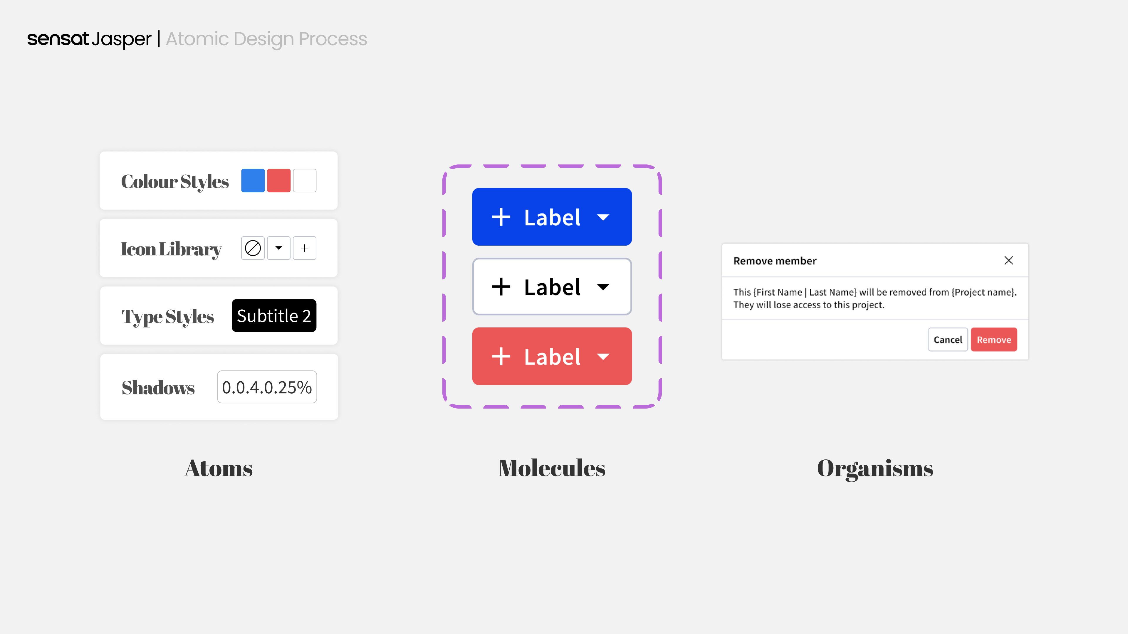
In the journey of constructing a design system, the Atomic Design Process serves as a fundamental methodology. Personally, I consider this process crucial for establishing structured and well-defined guidelines.
In this approach, atoms serve as the foundational building blocks, molecules represent basic components, and organisms are compositions of molecules, forming more intricate UI elements. This systematic breakdown allows for the creation of templates that can be effortlessly adjusted by modifying properties within the atoms, ensuring adaptability and coherence.
In this approach, atoms serve as the foundational building blocks, molecules represent basic components, and organisms are compositions of molecules, forming more intricate UI elements. This systematic breakdown allows for the creation of templates that can be effortlessly adjusted by modifying properties within the atoms, ensuring adaptability and coherence.
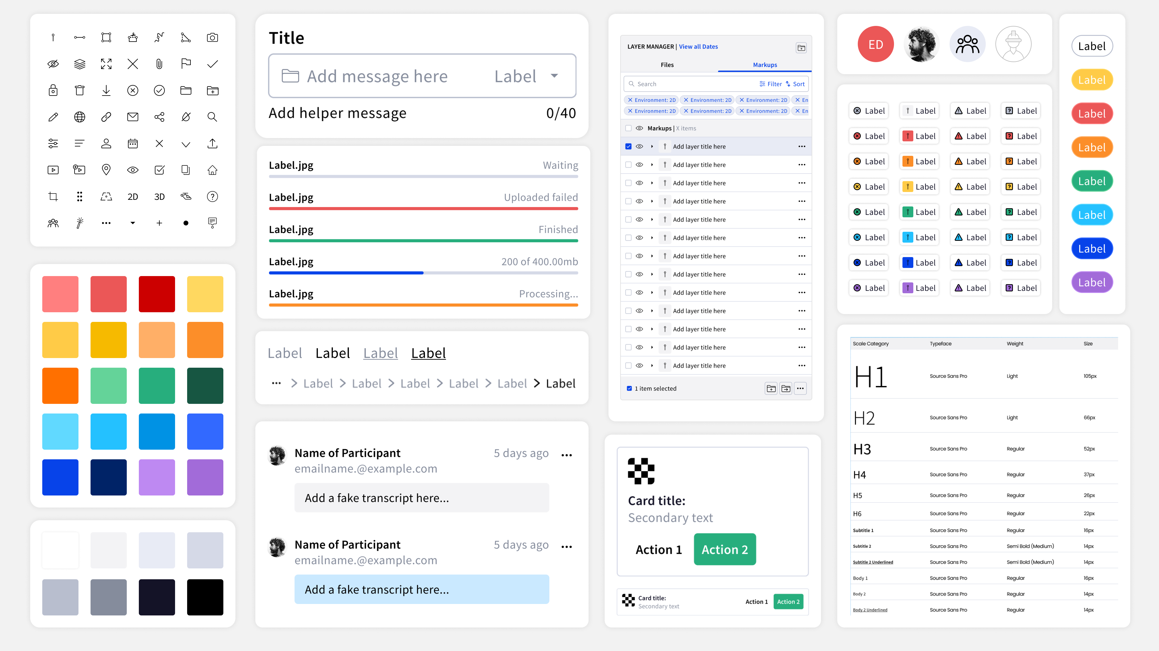
Atoms | Styles
Atoms serve as the fundamental building blocks for any UI component. In our context, atoms encompassed essential elements such as colours, typography, icons, shadows, borders, and our spacing system. Embracing the 4-point spacing system, we aimed to establish balance and consistency throughout the design, making atoms integral to the overall cohesion of the UI components.
Molecules | Components
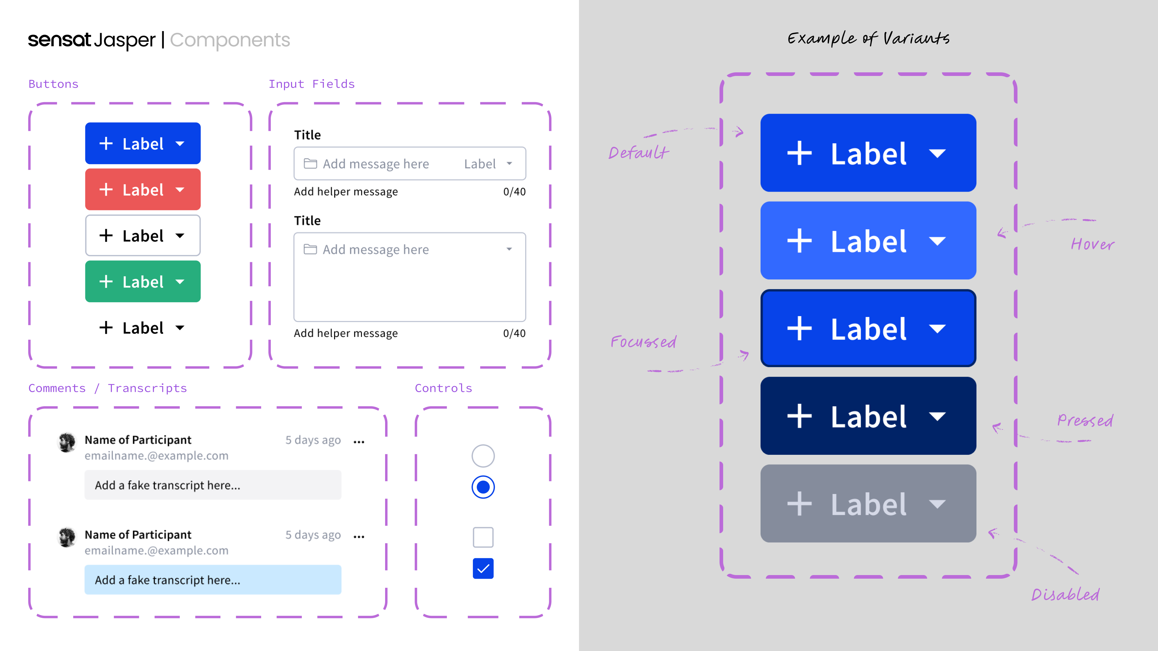
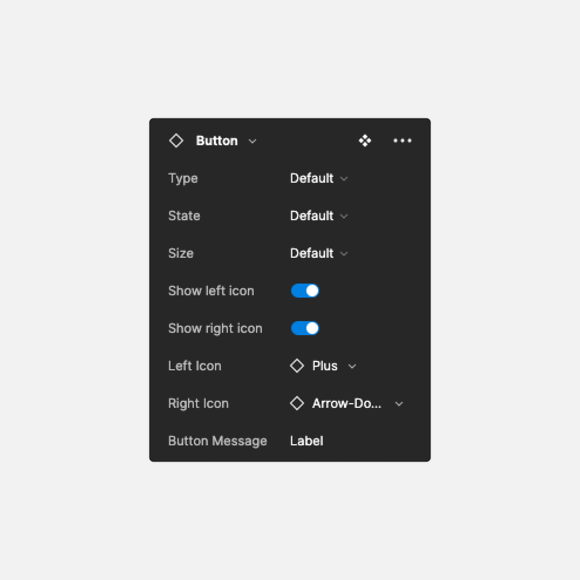
Once the atoms were established, the next step involved was crafting molecules, which took shape as fundamental components like buttons, input fields, and profiles. At this stage, I strategically incorporated variants, recognising that certain molecules, like buttons, could possess distinct properties across various states (default, hover, active) or sizes.
To enhance usability for designers, I introduced additional properties. These included features that facilitated quick icon changes from our icon library and swift modifications to text boxes for input fields, contributing to a more efficient design process.
To enhance usability for designers, I introduced additional properties. These included features that facilitated quick icon changes from our icon library and swift modifications to text boxes for input fields, contributing to a more efficient design process.
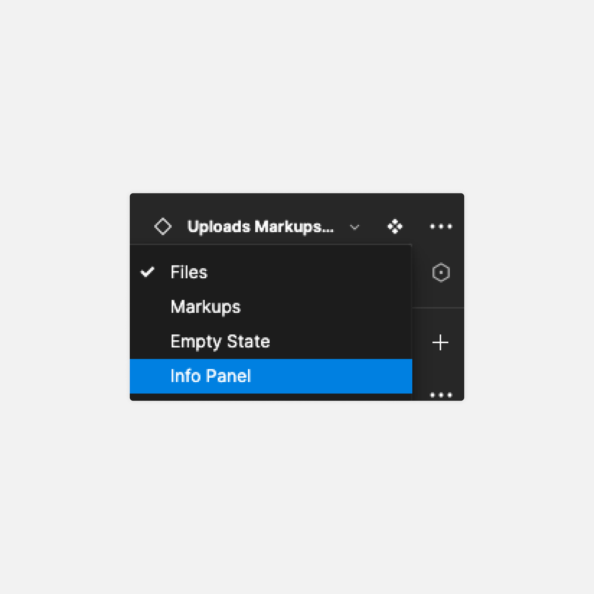
Organisms | Panels
In contrast to our previous component library, one notable advancement was the introduction of the organism stage. This phase allows the amalgamation of multiple molecules, forming templates or foundational elements for intricate UI designs. Examples include modals and menus, and organisms can become even more intricate by replicating UI panels with diverse behaviours.
The creation of organisms proves advantageous for designers, providing them with valuable starting points without the need to begin from scratch. This efficiency empowers designers to navigate through the design process more seamlessly.
The creation of organisms proves advantageous for designers, providing them with valuable starting points without the need to begin from scratch. This efficiency empowers designers to navigate through the design process more seamlessly.
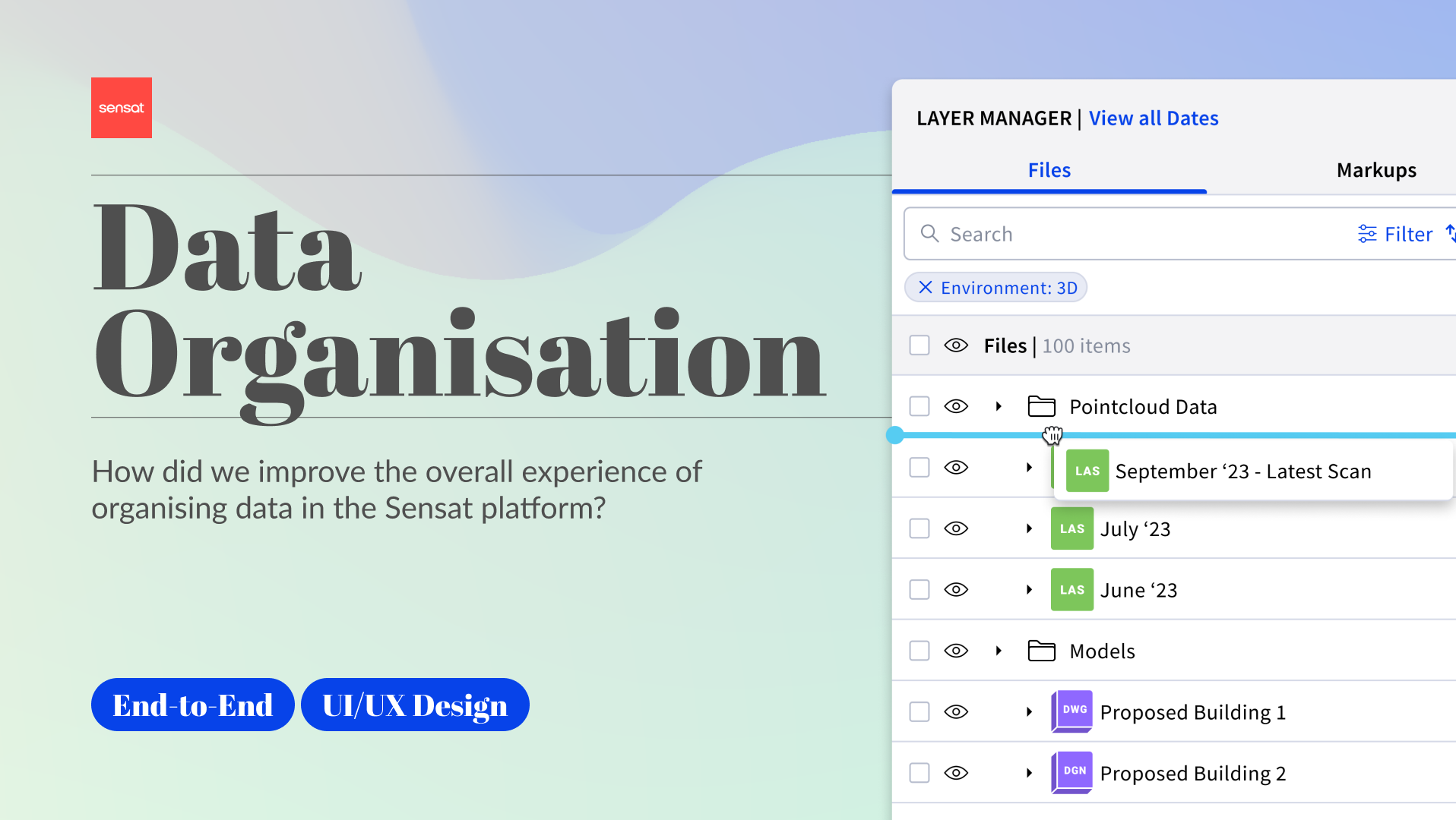
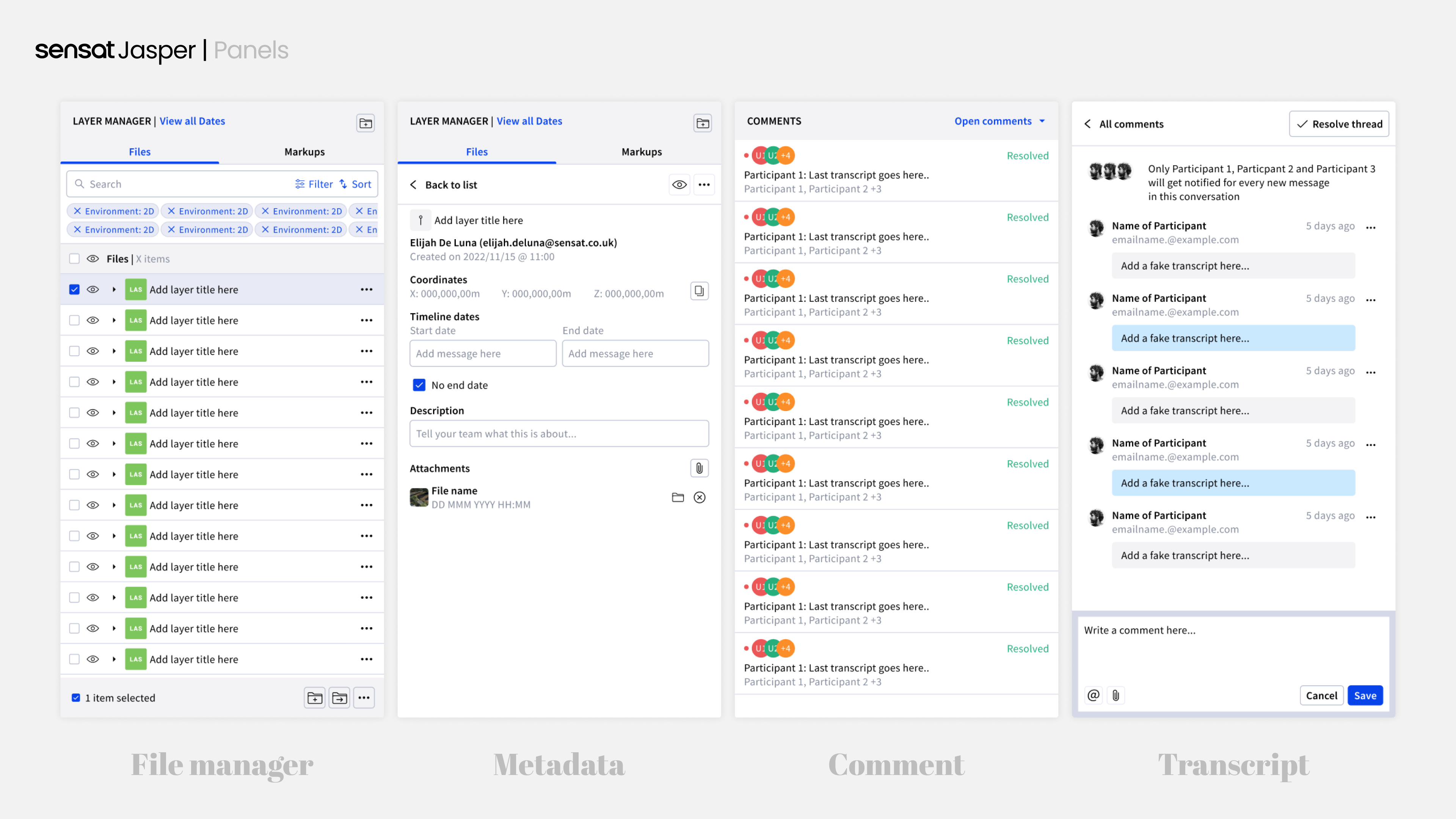
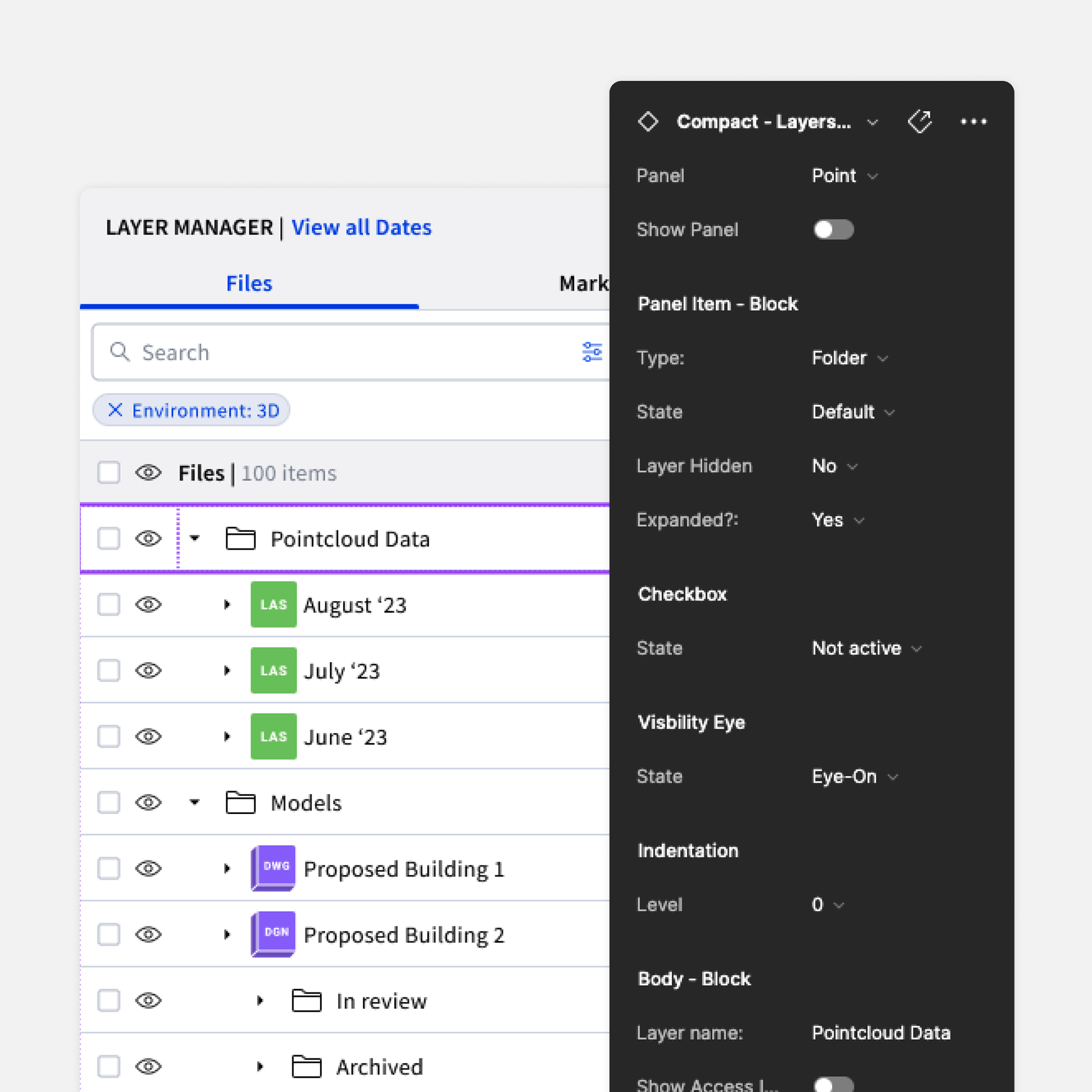
Our most complex component | U/M Panel
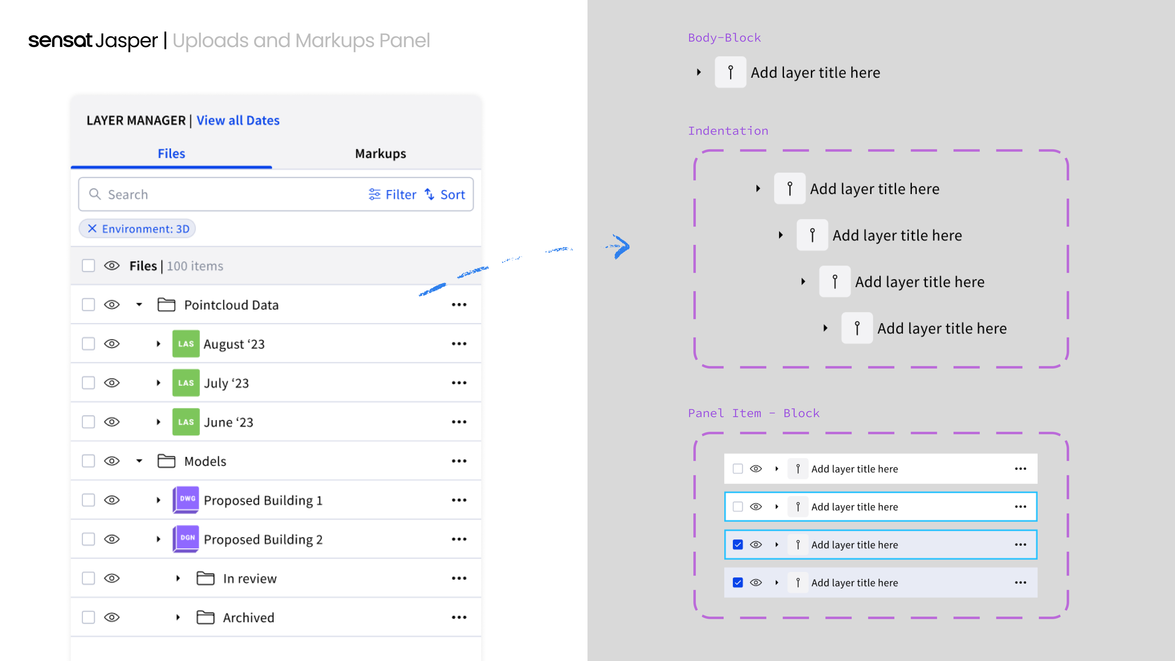
A noteworthy example of an organism I undertook was the creation of the Uploads and Markups panel within the Sensat platform. This multifaceted panel served as both a file manager and featured elements such as search functionality for swift data retrieval.
The file manager embraced a "tree-structure" methodology for file organisation, demanding careful consideration of margin adjustments, especially with the introduction of subfolders. Since Figma lacked clear definitions for margin sizes, I innovatively devised a solution to enable designers to visualise margin changes with varying subfolder levels.
My approach involved defining the content within a panel item and treating "margin" as a distinct property. Once states were established, I utilised Figma's nested components, simplifying the adjustment of panel item levels and facilitating easy margin modifications.
This intricate process, coupled with the incorporation of original state properties, text, and icon changes, made this undertaking the most complex yet immensely rewarding component I have created.
Implementation
The Design System primarily yields internal benefits, significantly enhancing collaboration between developers and designers by establishing stricter guidelines for consistency. For designers, it streamlines the design process by providing a clear understanding of component limitations, facilitating the creation of easily replicable designs.
During my tenure at Sensat, I successfully enhanced not only the workflow for product designers but also for other facets of the business. In marketing, the Design System simplified the creation of supporting assets, ensuring that the UI aligned with the latest updates and accurately represented our platform.
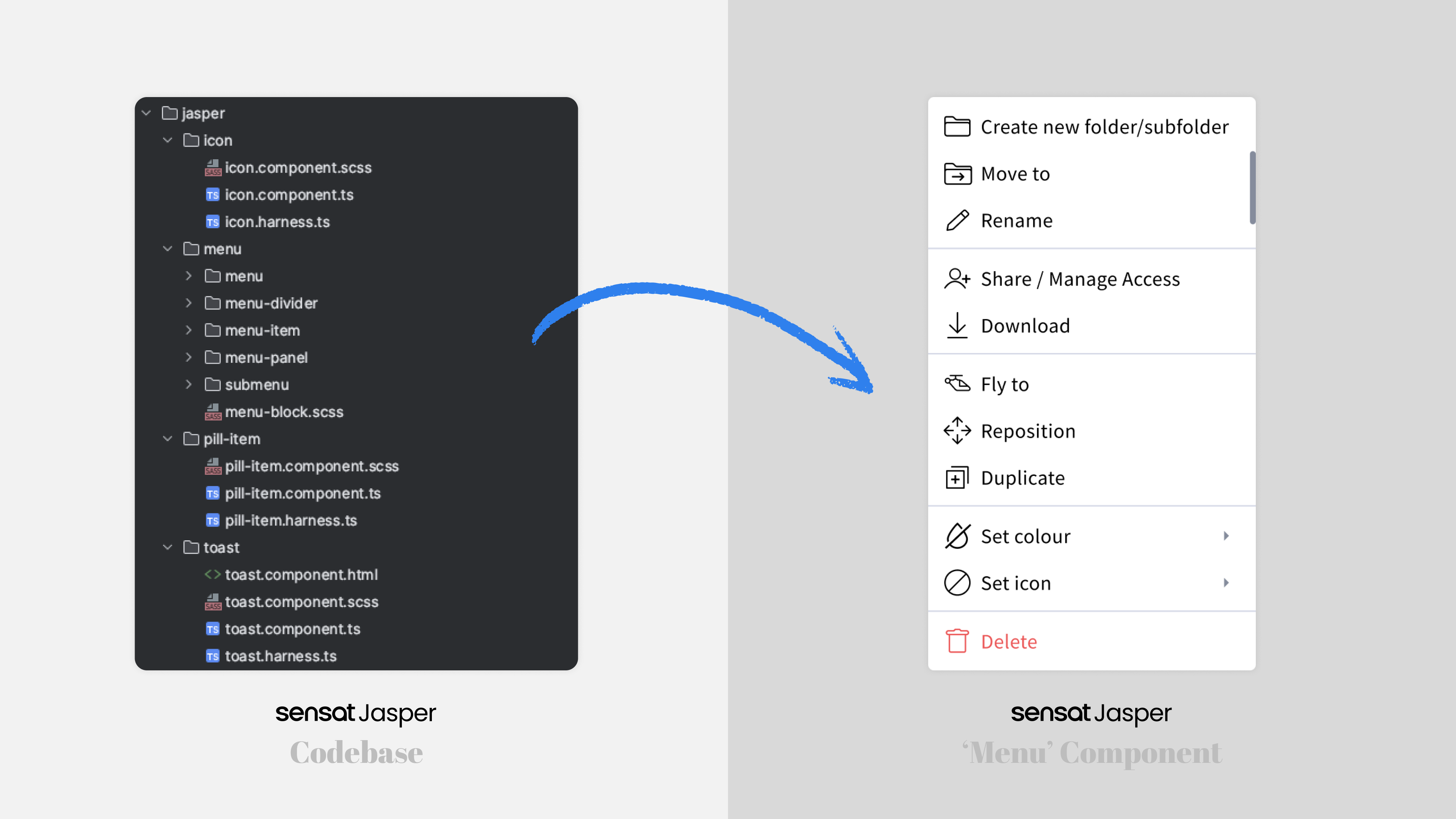
Furthermore, efforts were underway to integrate the Design System into the codebase, commencing with the menus—a widely used component throughout the application. This integration aimed to extend the benefits of the Design System to the operational core of the platform.
During my tenure at Sensat, I successfully enhanced not only the workflow for product designers but also for other facets of the business. In marketing, the Design System simplified the creation of supporting assets, ensuring that the UI aligned with the latest updates and accurately represented our platform.
Furthermore, efforts were underway to integrate the Design System into the codebase, commencing with the menus—a widely used component throughout the application. This integration aimed to extend the benefits of the Design System to the operational core of the platform.