Overview
Sensat acts as a vital link between users' latent data and a platform that facilitates comprehensive visualisation. Despite a surge in data uploads, users often sought a seamless integration with other software possessing compatible file structures.
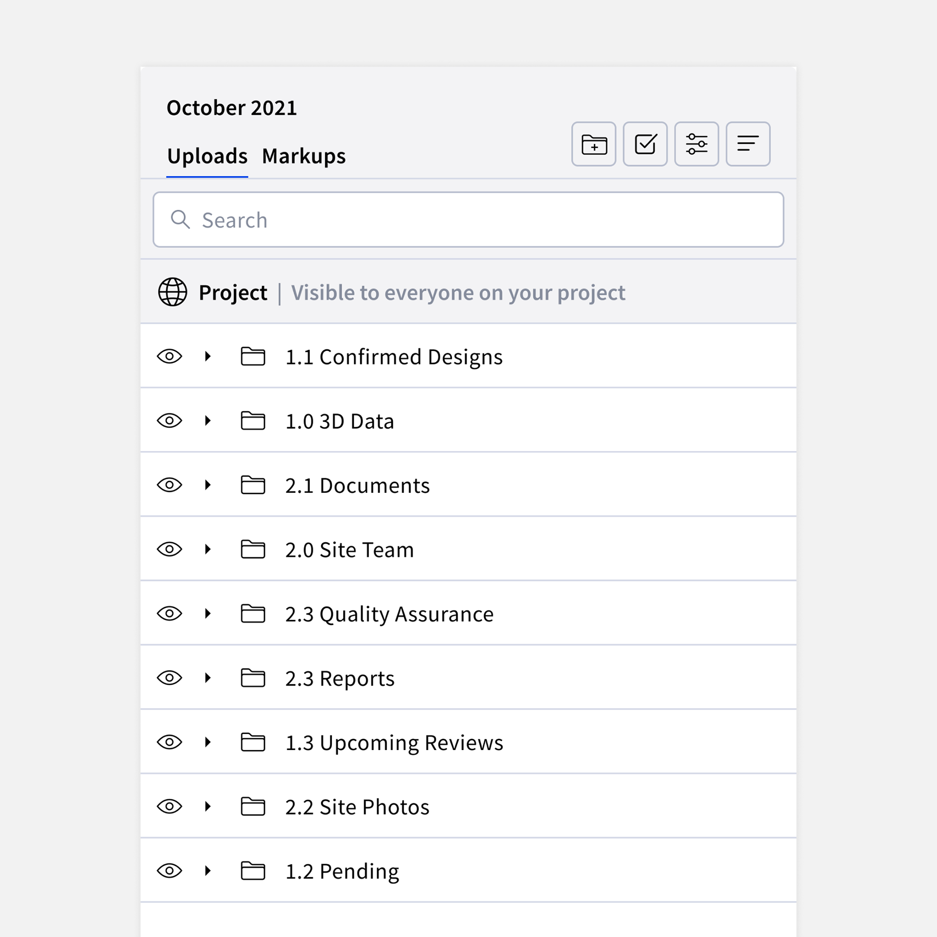
However, a significant hurdle arose due to the platform's inability to support multi-layered file structures. This limitation forced users to devise alternative methods, consuming more time and effort in restructuring their data. The absence of multi-layered file structures also led to data dispersion at the root level, creating confusion for users navigating the Uploads and Markups panel and hindering their ability to easily locate desired data.
Goal
The goal of the project was to create an optimal system for users to create existing folder structures from other softwares inside of Sensat. Through this project we also enhanced user experience by increasing discoverability of existing features and also create a familiarity between existing file manager softwares.
Role
My role in this project involved taking ownership of the entire end-to-end user project. This involved creating research plans and co-leading user workshops. Leading ideation workshops with the team to ensure the goal stays focused all the way through ideation and design and leading validation testing efforts to ensure solutions answered user problems.
The team consisted of 1 PM, 1 Designer and 4 Engineers.
The team consisted of 1 PM, 1 Designer and 4 Engineers.
Understanding user needs and research focus
At the start of a project, our first step was to gather both quantitative and qualitative data, distinguishing between what we already knew and what information was still unknown. This separation enabled us to concentrate more effectively on the specific details we sought from our users, refining our research questions for greater clarity.
As part of this process, we recognised the need to address distinct aspects of the user problem. We divided our research into two streams: one focused on understanding how users located information, while the other delved into their struggles with organising data. This approach allowed us to explore each aspect independently, recognising the unique insights within the distinct user processes of finding and organising information.
User engagement workshop
Once we formulated our research questions, we crafted a comprehensive research plan outlining our methods, participants, the timing and location of our sessions. During this phase, we actively involved our engineering team in the understanding phase, providing them with first-hand insights into user challenges.
To execute this plan, we opted for a workshop-style group session. This involved individual 1:1, in-person discussions between our team members and selected participants. While Sensat typically conducted research through virtual calls, we chose in-person chats to delve deeper into users' feelings about using Sensat. We believed this approach would allow us to capture more nuanced information by observing body language and meticulously noting participants' verbal feedback.
With the collaboration of a customer success team member, we successfully conducted a workshop involving active users.
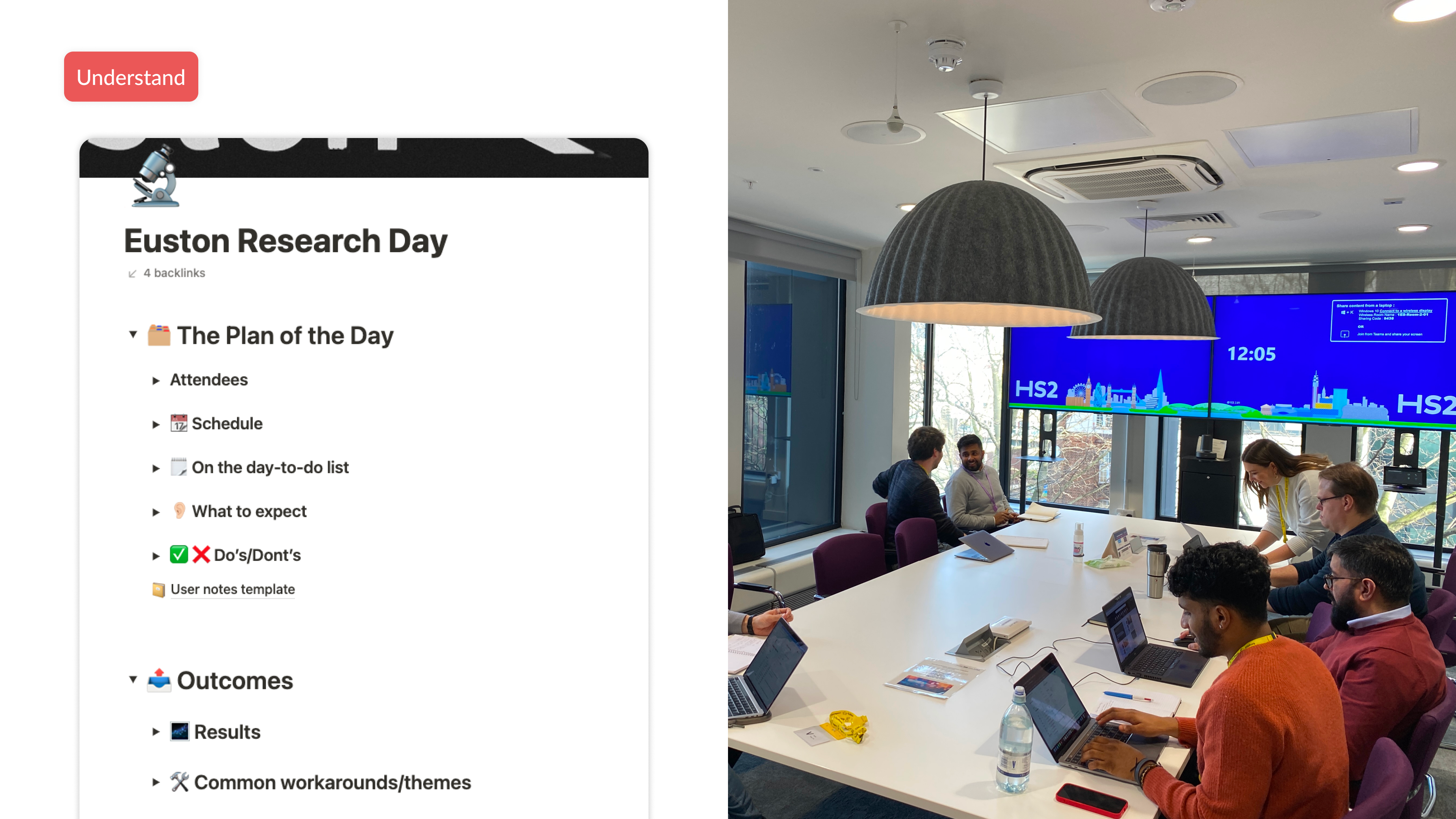
In-person workshops from our users with HS2 Euston
Synthesising insights
Following the conclusion of the workshop, we gathered all the notes recorded by the team and transitioned into the 'Define' stage. In this phase, our objective was to analyse the notes comprehensively, identifying patterns and trends.
By reviewing notes from each participant, we conducted a rapid brainstorming session to group the notes together logically. This process laid the foundation for identifying common themes and insights, setting the stage for a more structured analysis.
By reviewing notes from each participant, we conducted a rapid brainstorming session to group the notes together logically. This process laid the foundation for identifying common themes and insights, setting the stage for a more structured analysis.
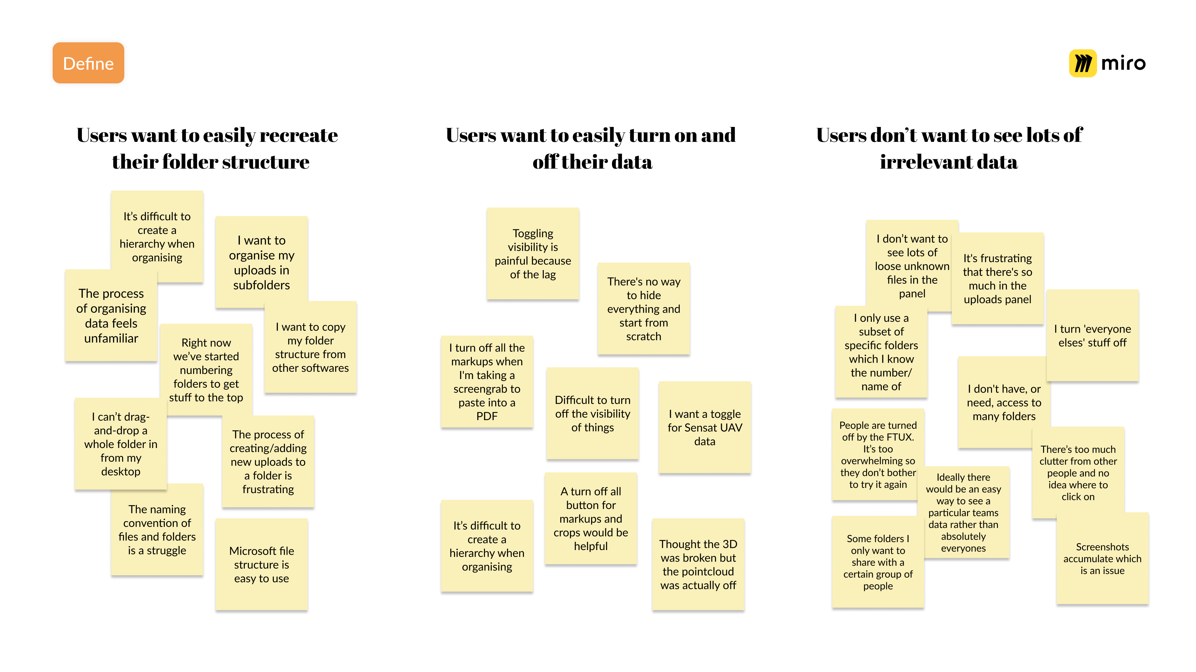
During the synthesising phase, we grouped user notes/quotes into their relevant buckets
Users had to think of other ways to represent a file structure in Sensat. Some projects ended up numbering their root folders to try and imitate it however this would break if users had their "sort view" set to most recent.
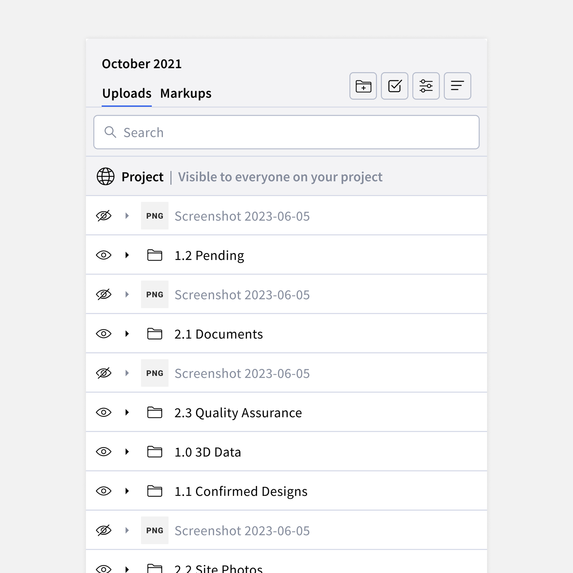
Because the file manager was a shared space, the lack of an established hierarchy meant you often got an accumulation of folders and loose files together. Screenshots accumulated a lot of space and were created by multiple people.
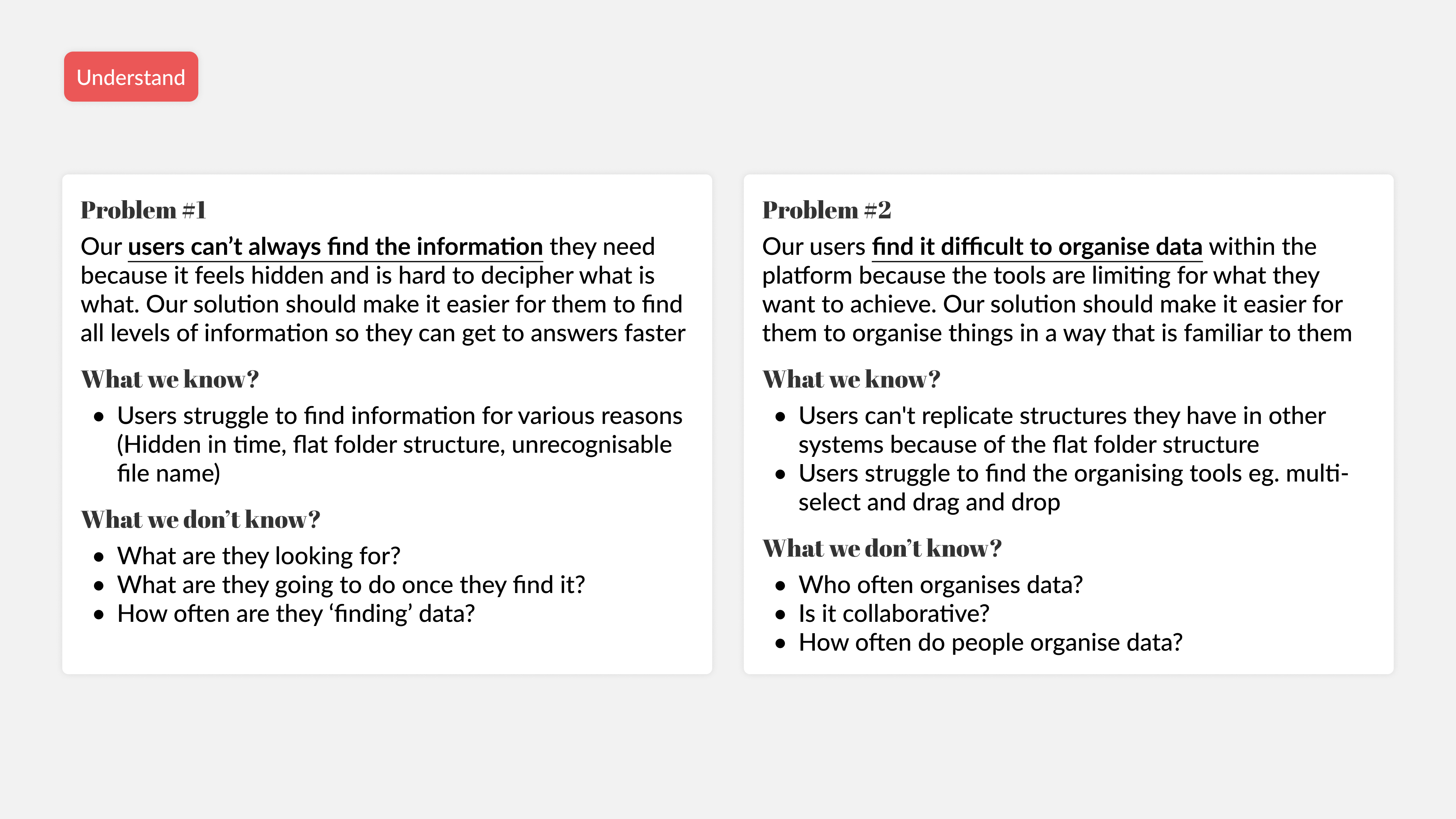
Connecting insights to the problem statement
Upon identifying patterns in our notes, our next step involved linking the collected data back to our initial problem statement and exploring potential opportunities and directions.
We utilised the 'Solutions Tree Diagram,' a framework notably employed by Netflix. This structured approach begins with the problem statement, followed by opportunities, and then potential solutions aligned with those opportunities.
While some opportunities had clear solutions, such as users desiring subfolders for replicating structures from other software (solution: create subfolders), other opportunities prompted more ideation and exploration to determine optimal solutions.
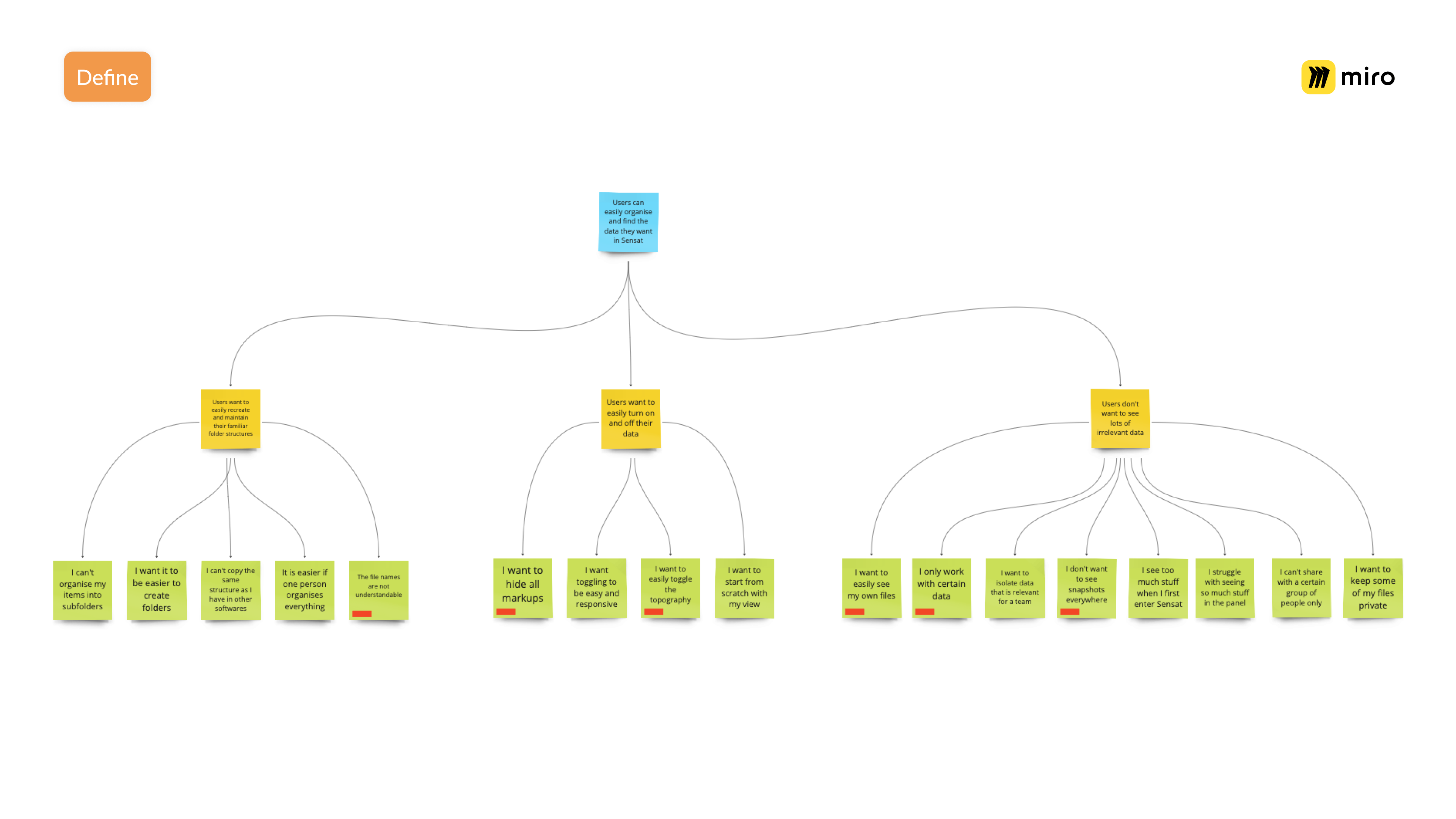
The solutions tree diagram helps visualise the problem statement and user opportunities followed by in-depth user 'wants'
Collaborative ideation with crazy 8
In the Ideate Phase, we once again assembled the engineering team to encourage them to contribute designs aligned with the opportunities identified in the Solutions Tree Diagram. To facilitate quick and diverse ideation, we organised a workshop utilising a simple Crazy 8 plan for each opportunity presented.
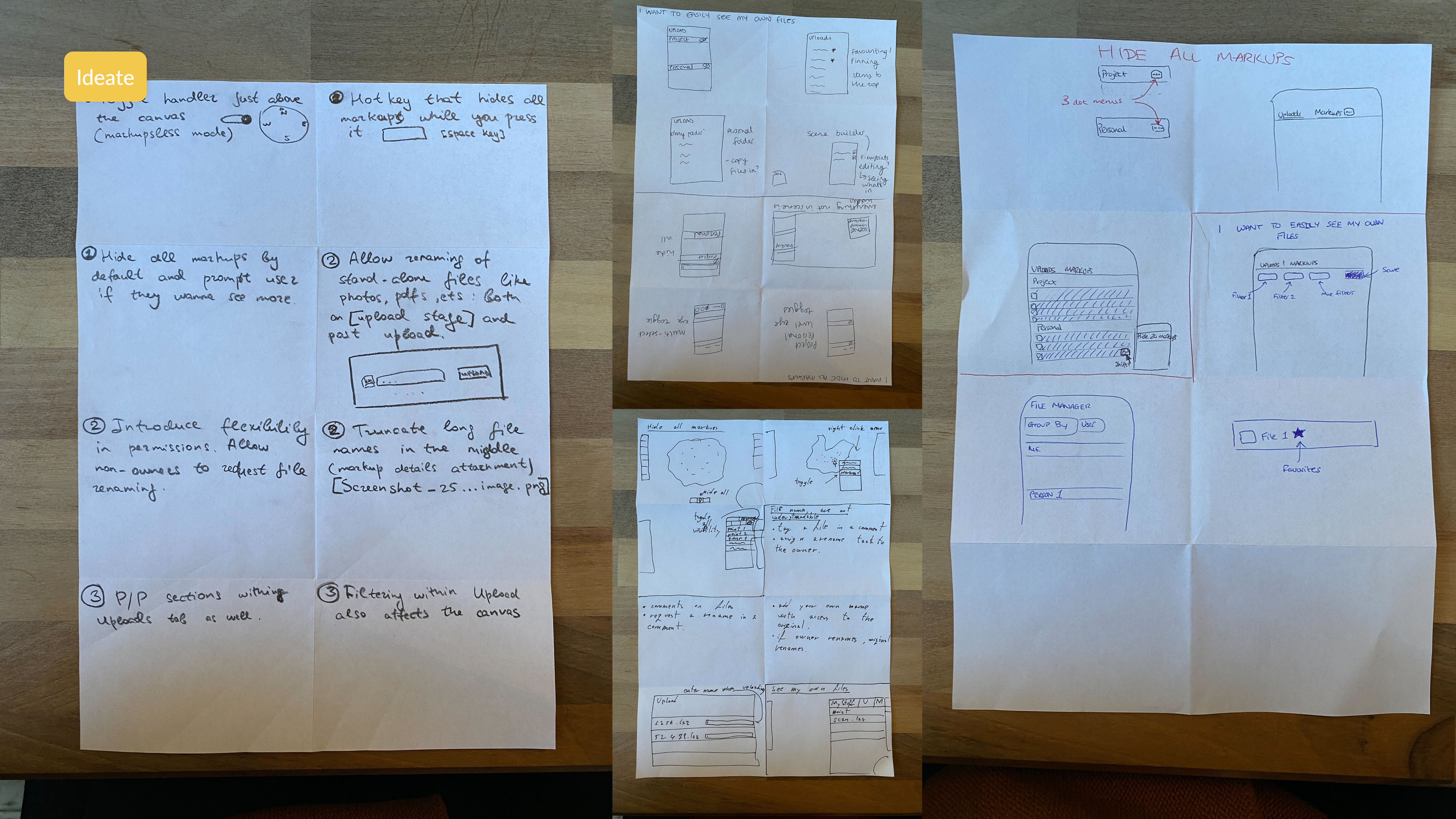
Outcomes from Crazy 8 Workshop with the team
Prioritising initiatives
Following the presentation of each member's drawings, we engaged in a discussion to prioritise initiatives using a value/effort matrix. This discussion aimed to assess the technical complexity of each outcome and gauge the level of user value associated with each idea.
In my perspective, framing each initiative against this matrix provides a fairer approach compared to traditional dot voting methods, as it minimises the potential for biases to influence the decision-making process. This strategic approach ensures a balanced evaluation, considering both technical feasibility and user impact.
In my perspective, framing each initiative against this matrix provides a fairer approach compared to traditional dot voting methods, as it minimises the potential for biases to influence the decision-making process. This strategic approach ensures a balanced evaluation, considering both technical feasibility and user impact.
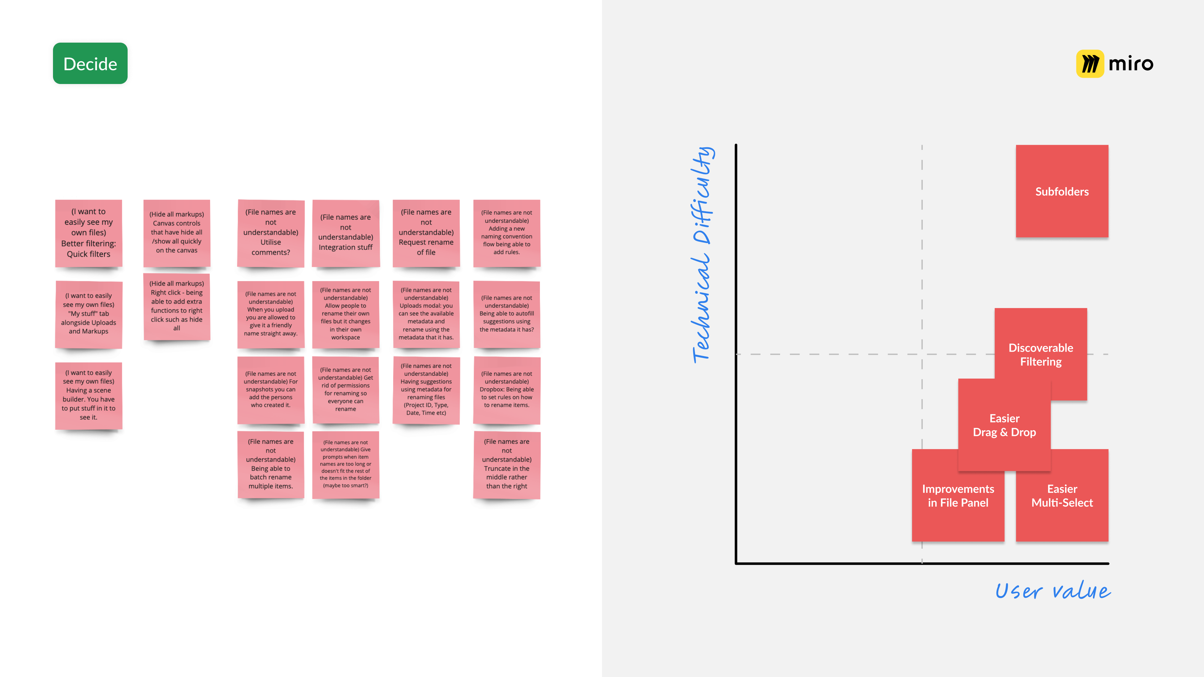
We used a value/difficult matrix to decide which projects we wanted to take forward. We decided on a mixture of big bets as well as small but potentially impactful quick wins.
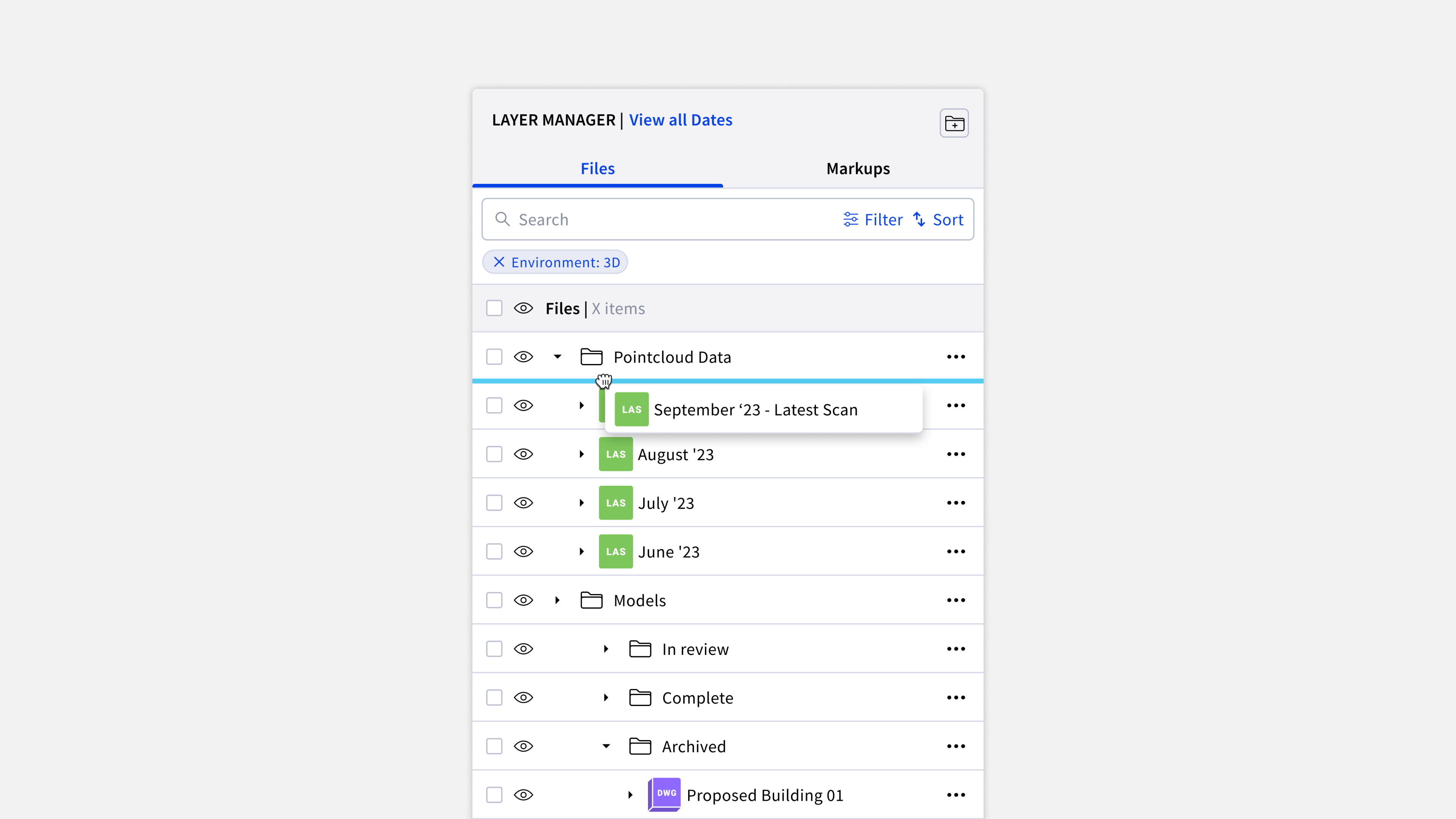
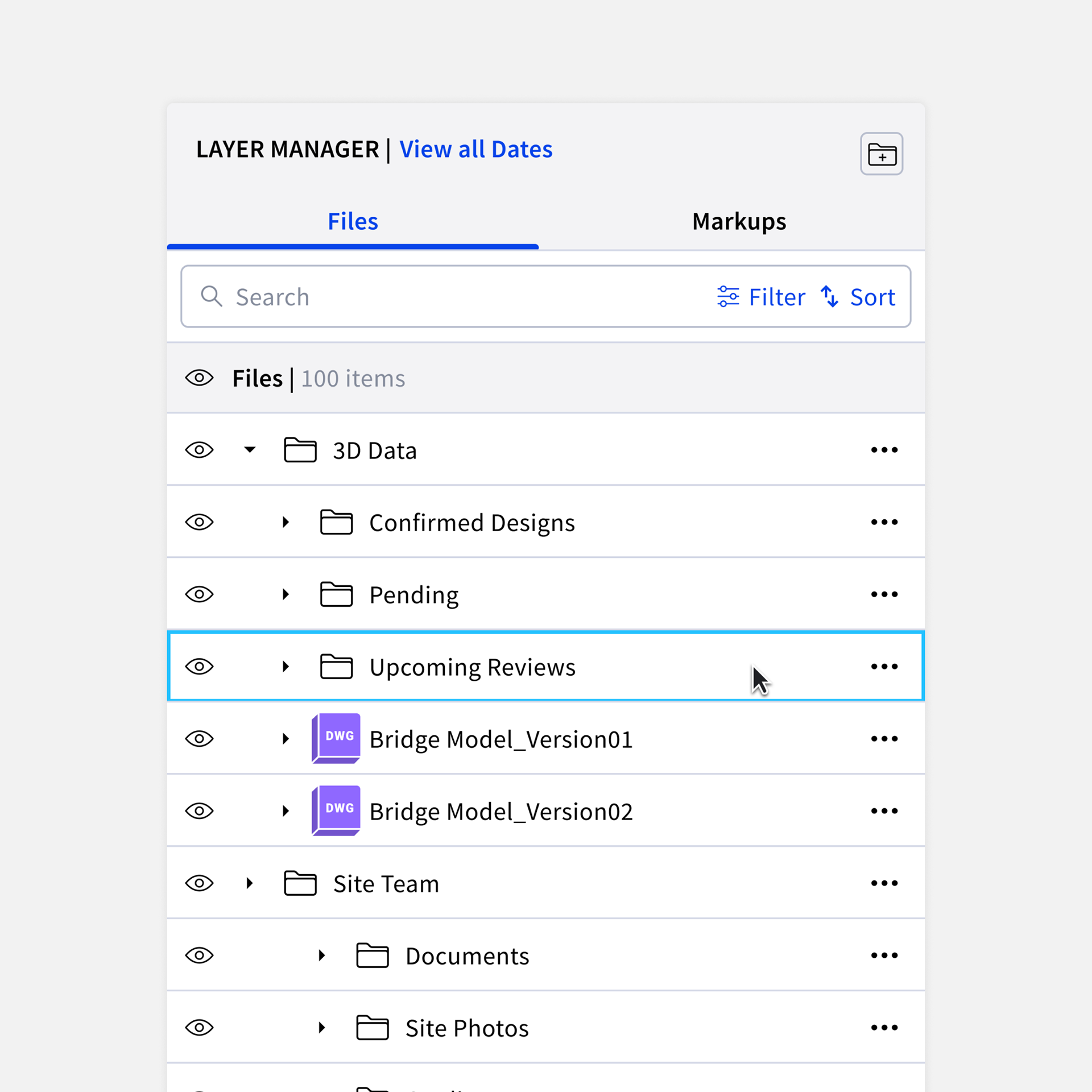
Introducing a key feature: subfolders
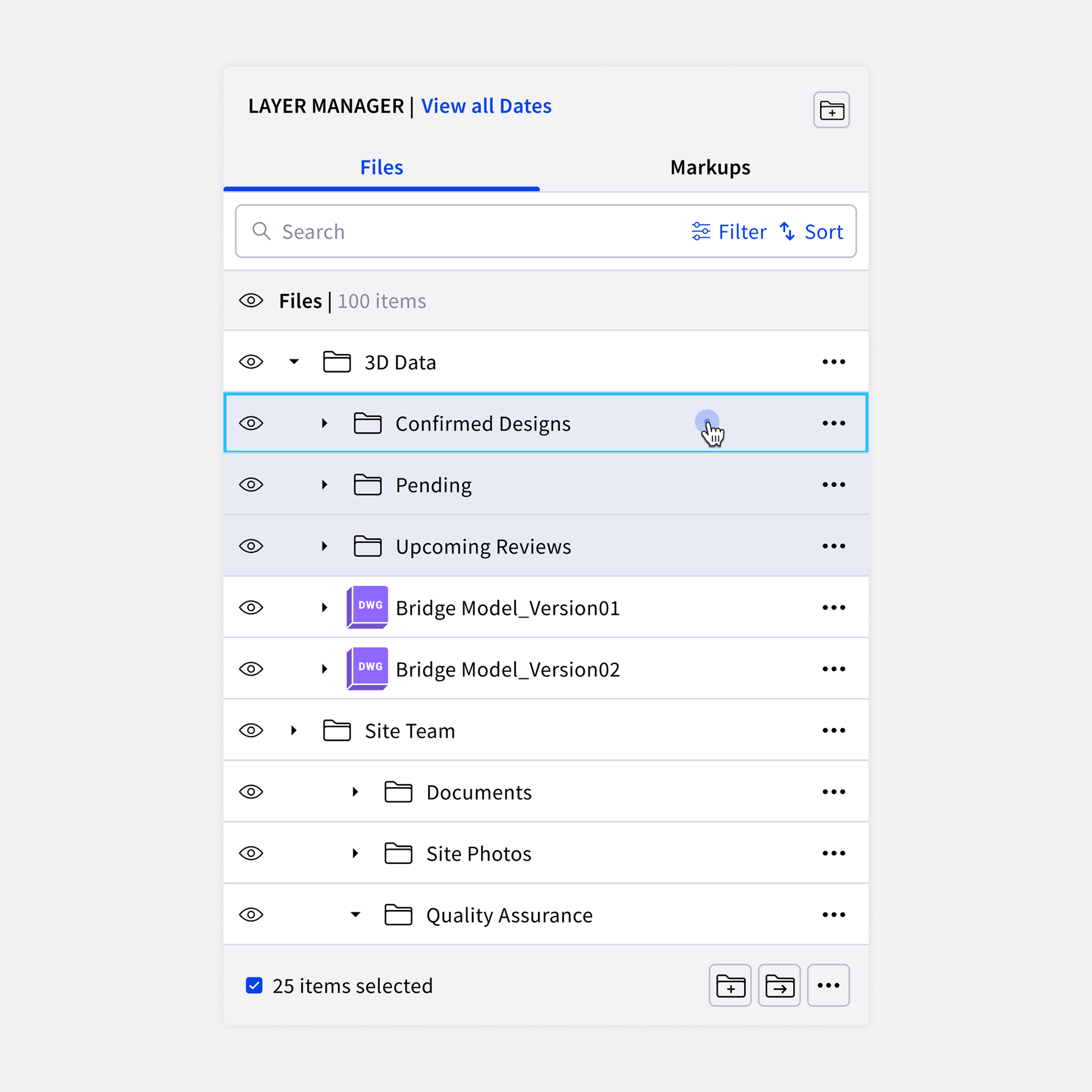
As part of this project, we successfully rolled out a highly requested feature – the ability for users to create subfolders. This addition addressed a major user demand, enabling them to mirror file structures from other platforms within Sensat.
Technically, incorporating subfolder levels as a building component for the design system posed a challenge. Figma, the design tool used, currently lacks seamless support for adjusting margins, adding a layer of complexity to the implementation. Despite this challenge, we were able to deliver a solution that greatly enhanced the user experience.
Technically, incorporating subfolder levels as a building component for the design system posed a challenge. Figma, the design tool used, currently lacks seamless support for adjusting margins, adding a layer of complexity to the implementation. Despite this challenge, we were able to deliver a solution that greatly enhanced the user experience.
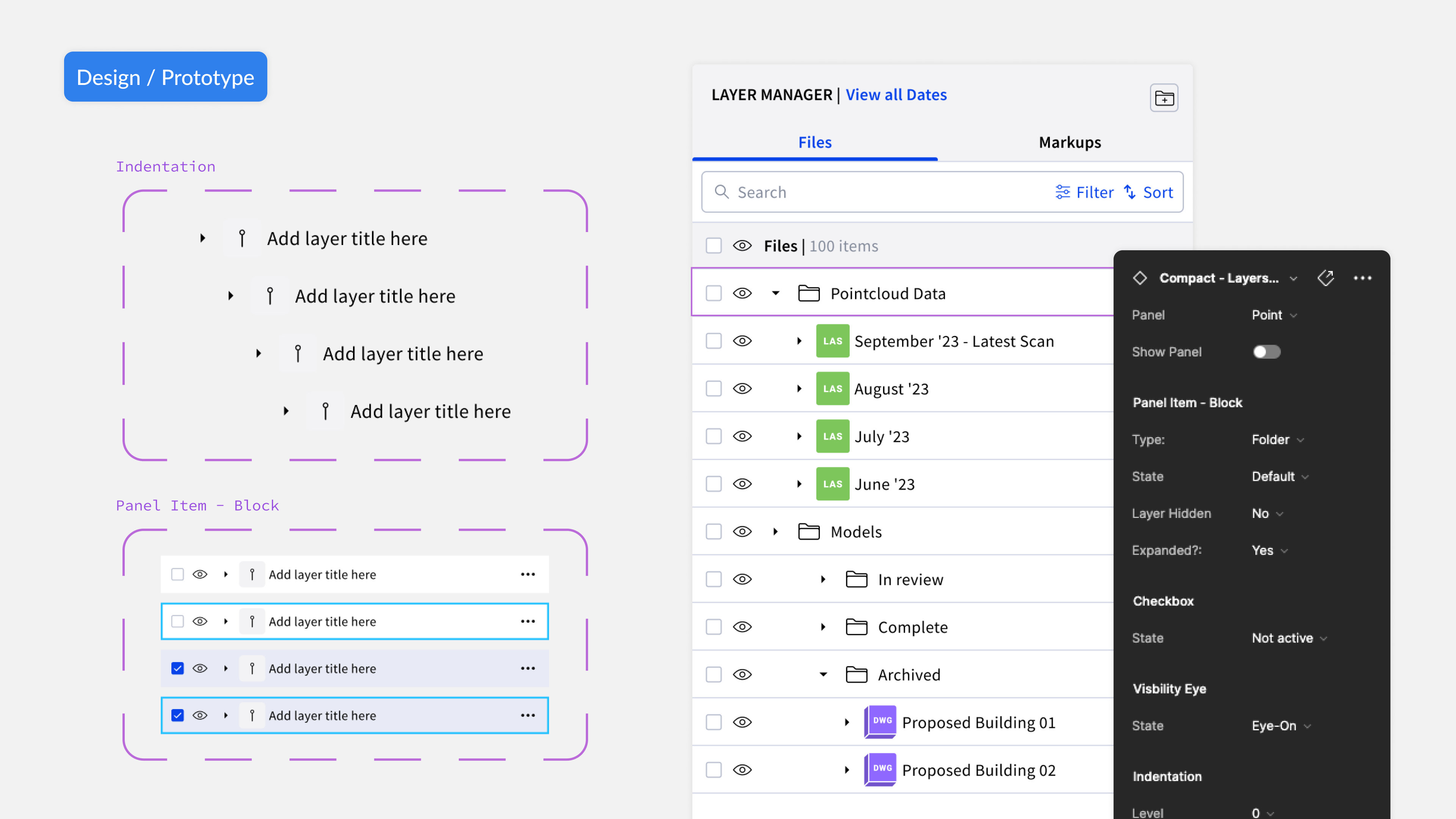
Component Building for subfolders in the Sensat Design System
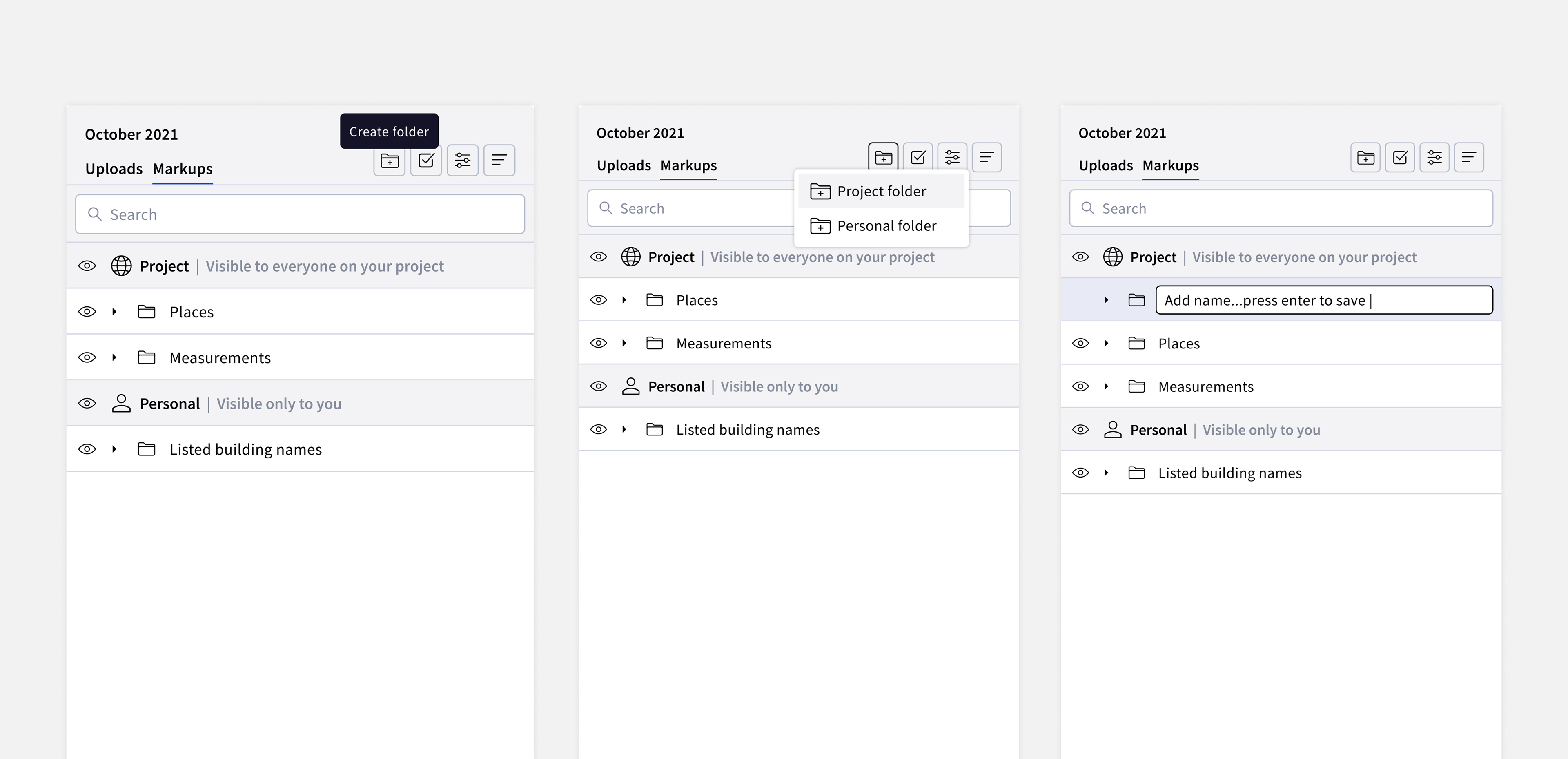
Flow: User can create empty root folders
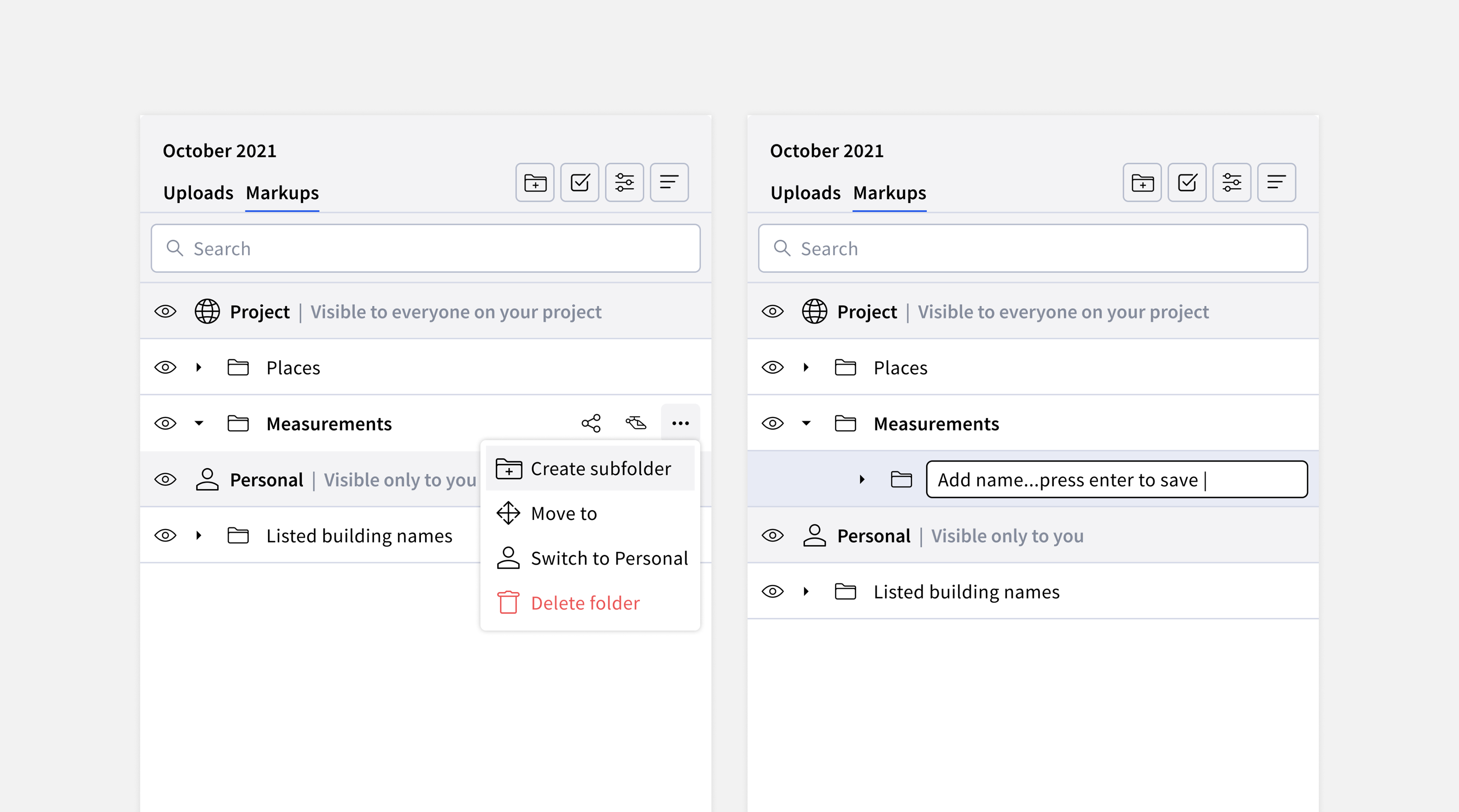
Flow: Users can create a subfolder through a 3-dot action
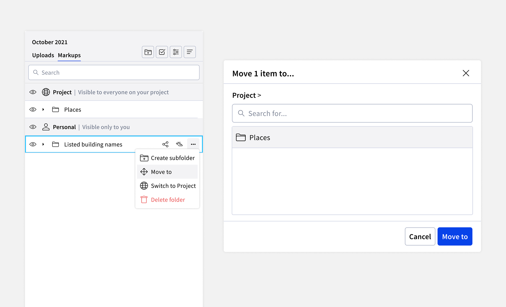
Flow: Users can create subfolders by moving existing folders inside of other folders
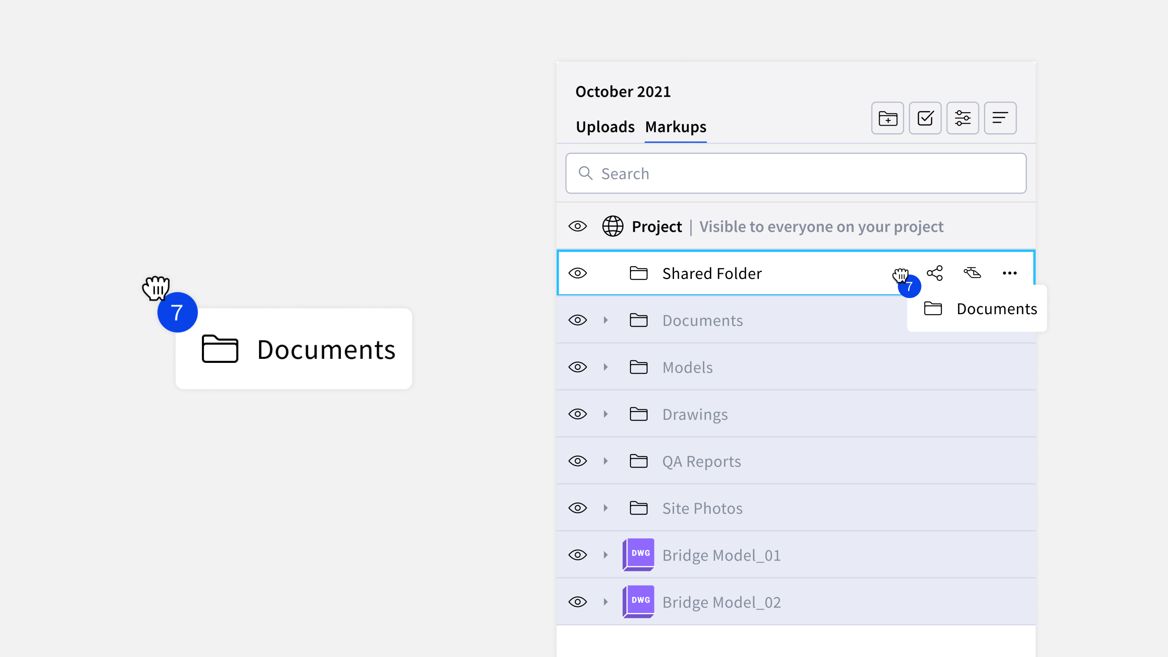
Removing barriers: Users can create subfolders by dragging and dropping items inside folders
Enhanced discoverability for users
Through our user interviews and opportunity diagrams, a recurring theme emerged—users desired the ability to view specific subsets of data, whether their own or a certain type. While features like filtering and multi-select were already present in the platform, it became apparent that there might be a higher entry barrier to access these tools, causing confusion among users.
From our interviews, it became evident that users struggled with the icons displayed on the top right, often misinterpreting their functions. For instance, the tick icon was mistaken for a checkbox rather than a means to enter multi-select, and the sort icon was confused with an align tool.
To address this, a significant change was implemented to enhance discoverability. We made these tools more apparent, ensuring users clearly understood the buttons' meanings. Additionally, we removed barriers to entry, making multi-select a permanent action within the panel, enabling users to employ it seamlessly at any time.
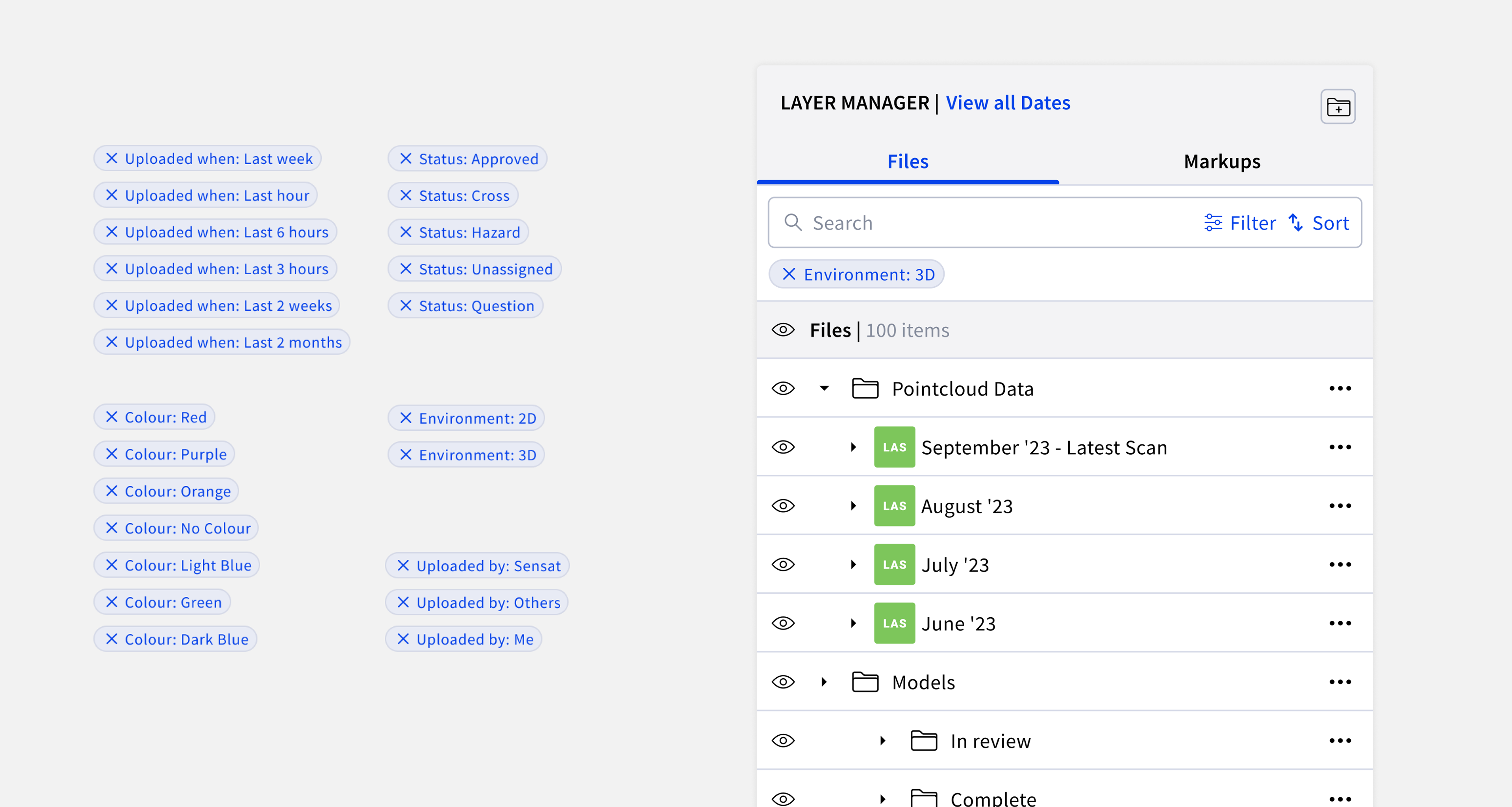
Removing barriers: Easy affordance to let users know what filters have been applied through the introduction of filter pills
Removing Barriers: We also removed the multi-select toggle mode by making it a permanent feature
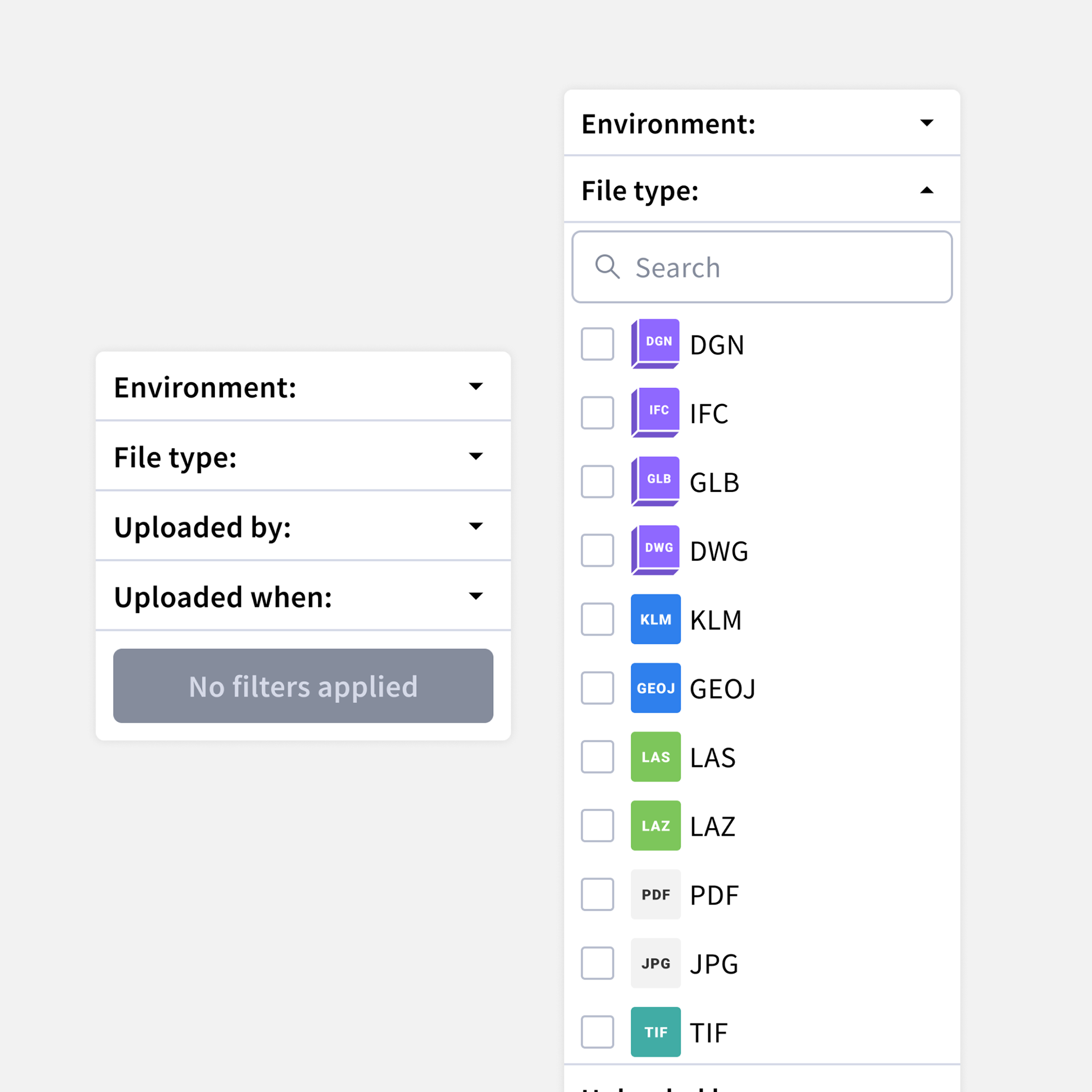
Redesign filter panel for better hierarchy as well as changing results to be more objective focusing on filetypes rather than semantic naming
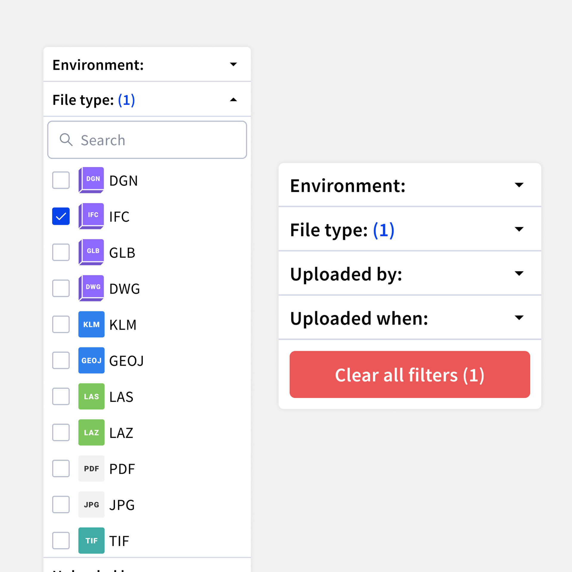
Easy way to know what filters have been applied through number count also clear call-to-action to remove currently applied filters
Creating a familiar user experience
Responding to user requests for a more familiar data appearance, we evaluated the UX of the panel to incorporate behaviours observed in other file management software, aiming to enhance user comprehension and drive platform usage.
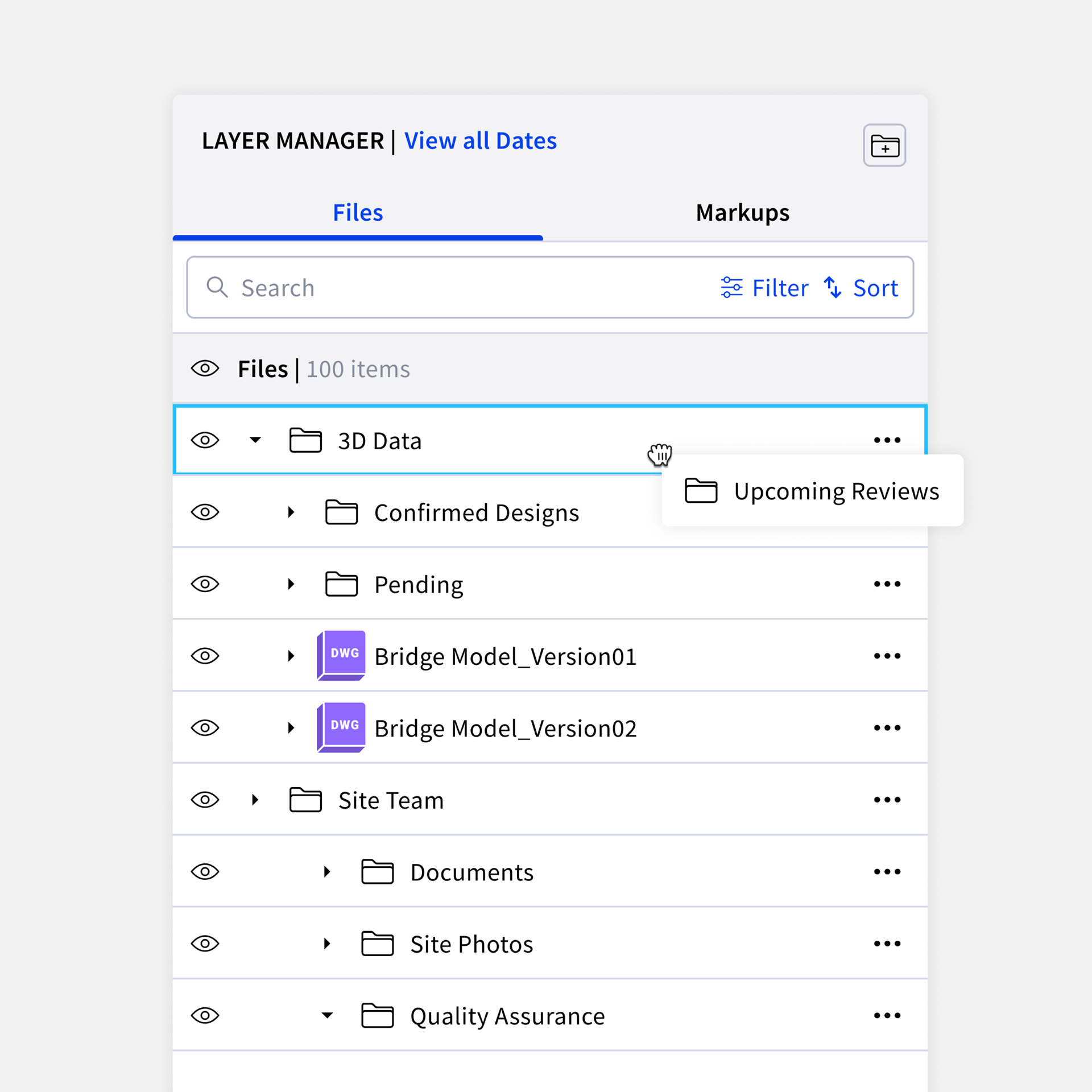
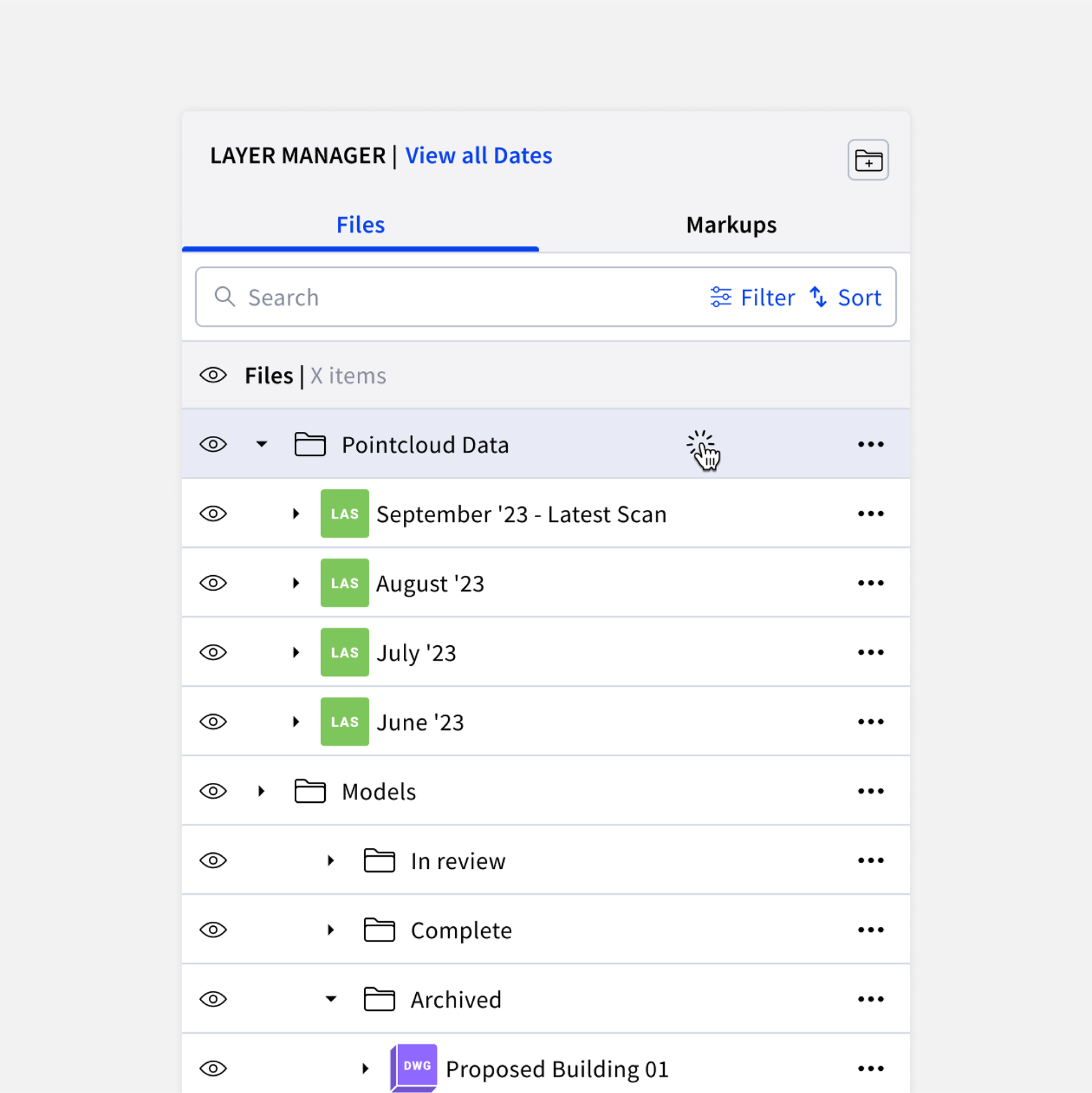
A subtle yet impactful change was the introduction of an industry-standard UX adjustment known as 'Folder-first' hierarchy. This automatically organised the panel to consistently display folders prominently, regardless of their level in the hierarchy. This UX approach mirrors the organisation seen in popular file software such as Google Drive and ACC.
Another recognisable UX improvement involved implementing the ability to drag and drop files within folders and subfolders. This intuitive feature significantly reduced the number of clicks required to move data across different panel sections, serving as a convenient alternative to the 'move-to' action button found in the three-dot menu. These changes aimed to create a more user-friendly and familiar environment for users navigating the platform.
Familiar UX: Change default sort to A-Z to make it easier to find folders and files
Familiar UX: Introducing Folder-first hierarchy to make it easier to find user-generated content (folders) vs individual/loose files
Validation testing
While designing the initiatives mentioned earlier, we also allocated time for validation testing with both our users and internal testing involving our Customer Success team.
I developed prototypes that captured essential changes anticipated in the Uploads and Markups Panel, including the introduction of subfolders and alterations in data hierarchy (e.g., folders first). The validation testing proved valuable, providing insights into how the changes would be perceived by a smaller audience and gauging users' comprehension of certain actions within the platform.
I developed prototypes that captured essential changes anticipated in the Uploads and Markups Panel, including the introduction of subfolders and alterations in data hierarchy (e.g., folders first). The validation testing proved valuable, providing insights into how the changes would be perceived by a smaller audience and gauging users' comprehension of certain actions within the platform.
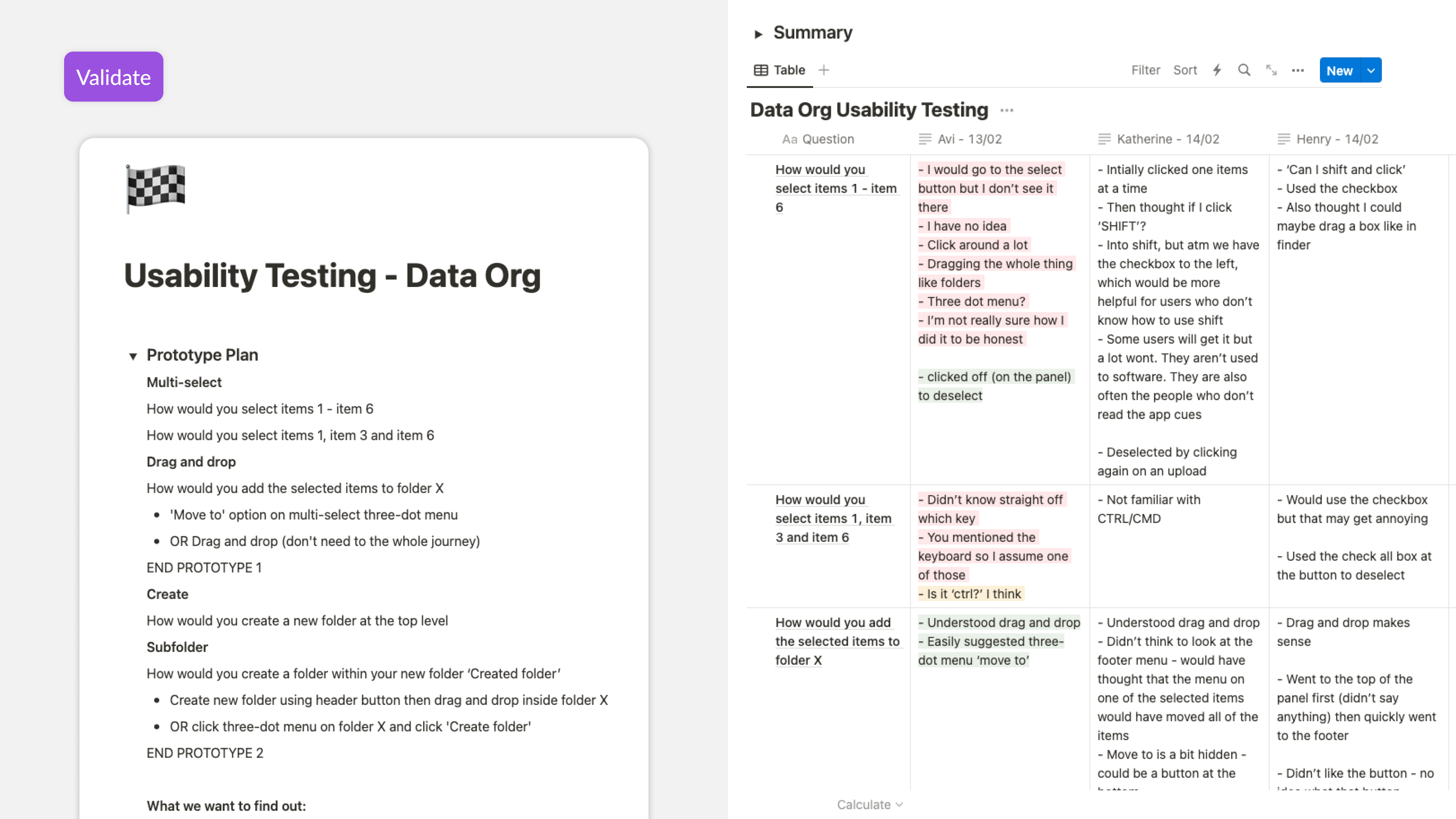
Don't: Users struggled when it came to selecting multiple items as they weren't aware of the keyboard shortcuts needed to use it.
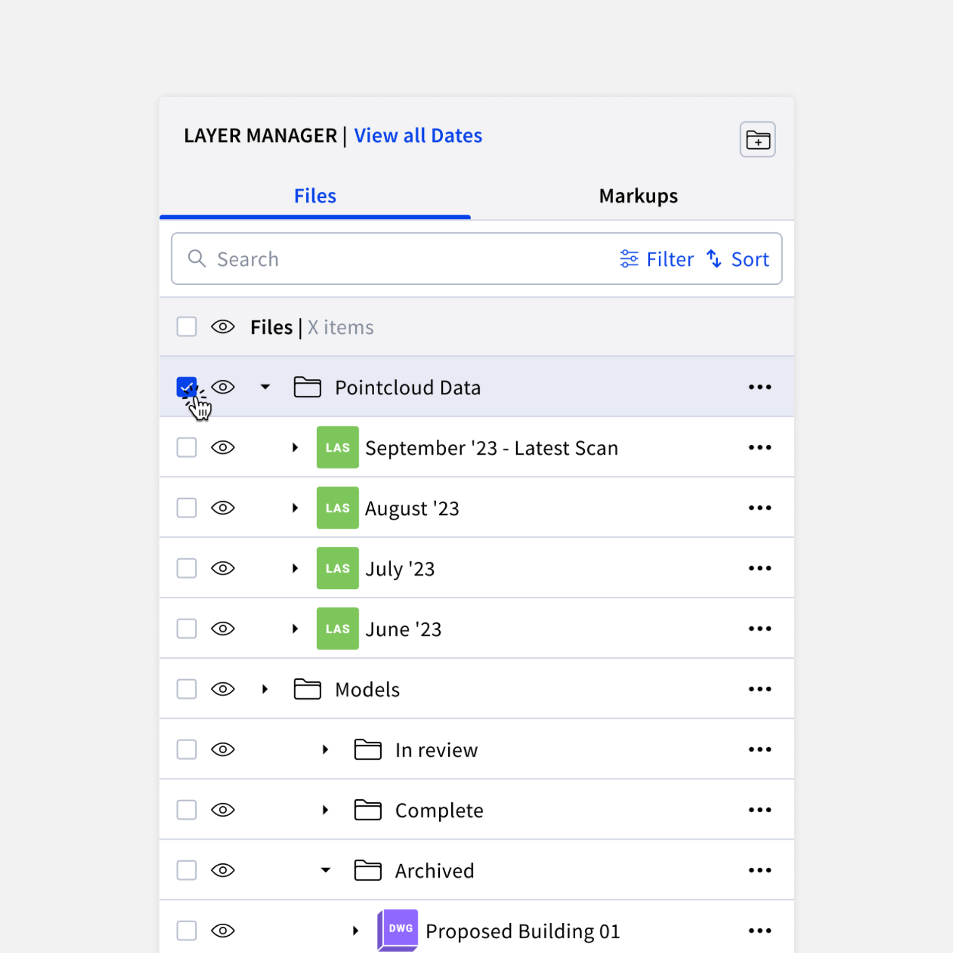
Do: We reverted to placing checkboxes permanently in the panel items to make it easier to select multiple items
Results: understanding your users
A noteworthy instance of successful validation testing was observed in the multi-select behavior. One of the enhancements we implemented aimed to simplify the adoption of multi-select. Previously, users had to click a multi-select button to enter a multi-select state, making the organizing process cumbersome. We decided to make multi-select available at all times by clicking on the panel item itself, eliminating the need for a checkbox.
However, user feedback revealed that the checkbox served a valuable purpose in selecting certain panel items, especially for users less familiar with keyboard commands like SHIFT or CMD/OPT to select multiple items. Consequently, we made design adjustments, including a checkbox on each panel item to cater to users who may be less tech-savvy, ensuring a more inclusive and user-friendly experience.
However, user feedback revealed that the checkbox served a valuable purpose in selecting certain panel items, especially for users less familiar with keyboard commands like SHIFT or CMD/OPT to select multiple items. Consequently, we made design adjustments, including a checkbox on each panel item to cater to users who may be less tech-savvy, ensuring a more inclusive and user-friendly experience.
Was it effective?
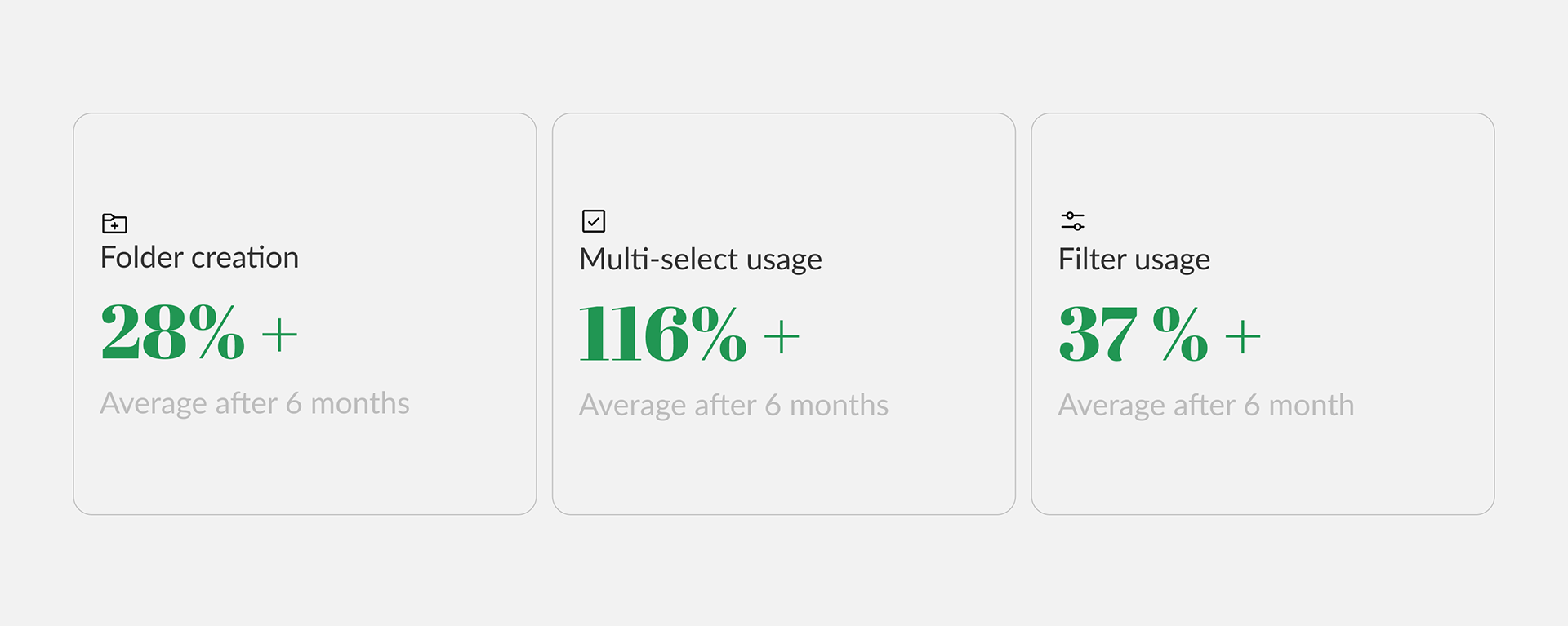
We gauged the effectiveness of our initiatives through key metrics, primarily focusing on user engagement. Initiatives aimed at improving discoverability were anticipated to positively impact feature usage frequency. For new features like subfolders, our expectation was an overall increase in the creation of folders, as users gained the ability to replicate folder structures from other software platforms.